Pathway to Purpose: Self-Improvement App
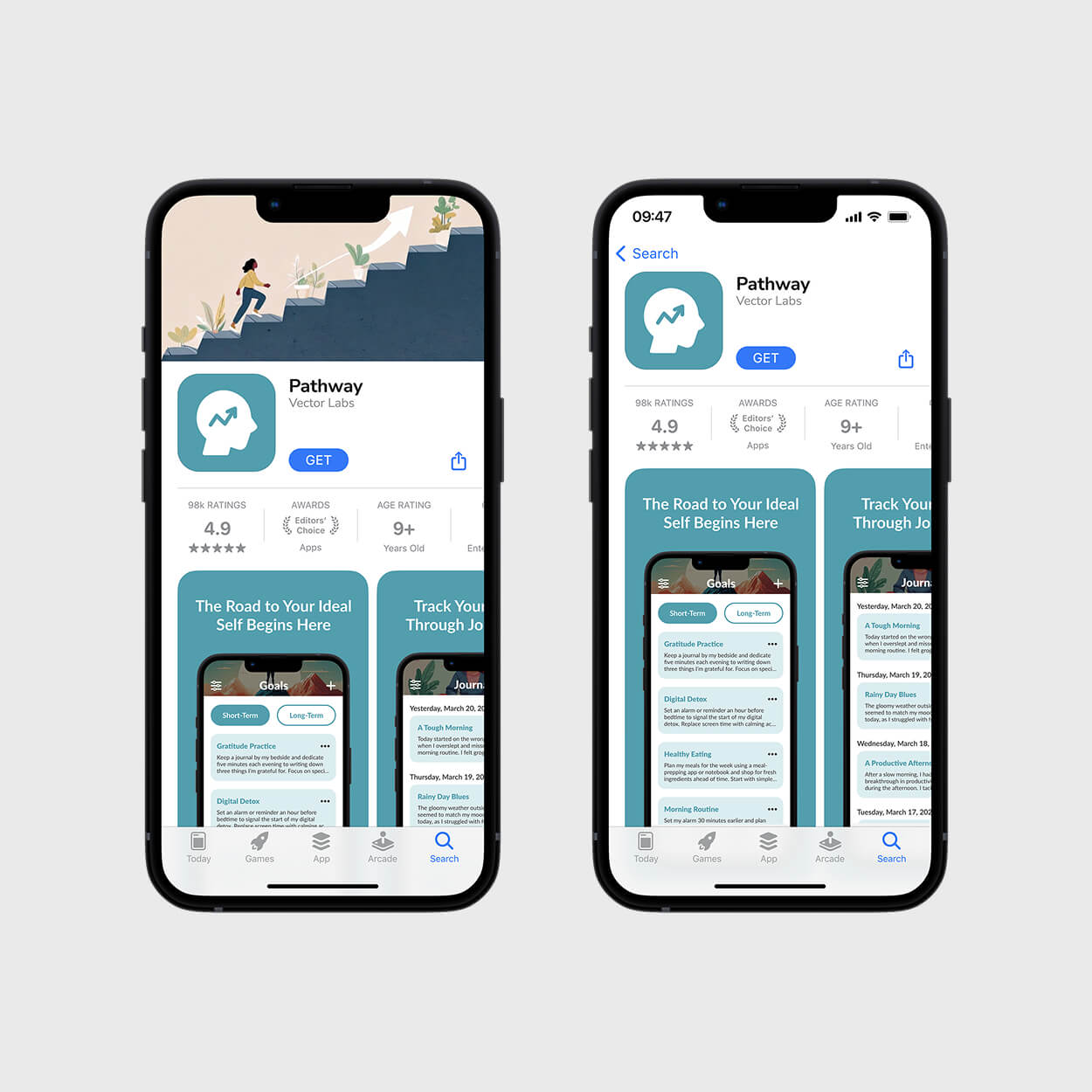
This UX/UI project focuses on designing Pathway, a self-improvement application that addresses a critical flaw in existing tools: their heavy reliance on generic, demotivating statistics. I designed Pathway to help users define and achieve their ideal self through tailored short- and long-term goals that foster genuine, personalized growth rather than tracking raw numbers.
Categories
UX/UI Design
User Research
Visual Identity Design
Interaction Design
Prototyping
Tools
FigJam
Figma
Overview
The challenge was differentiating the app in a crowded self-improvement market by addressing a key user frustration: the over-reliance on confusing graphs and quantitative metrics to track progress. My goal was to design an interface that was simple and intuitive, moving beyond complex data visualization to focus on core user needs. The app's design strategy centers on three essential areas: a dedicated Goals tracker, a Journaling feature, and a clearer, more personalized Progress overview.
Skills
Research-Driven
Persona Development
Wireframing
Prototyping
Strategy & Execution
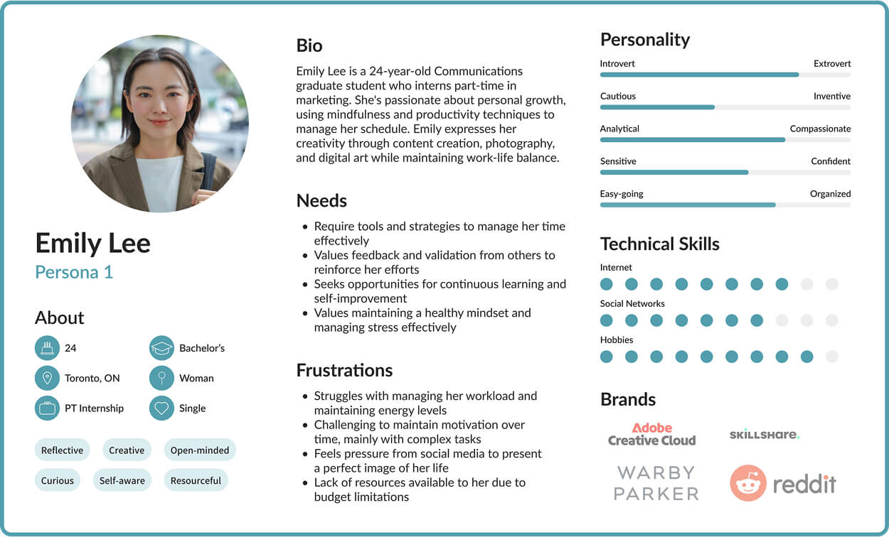
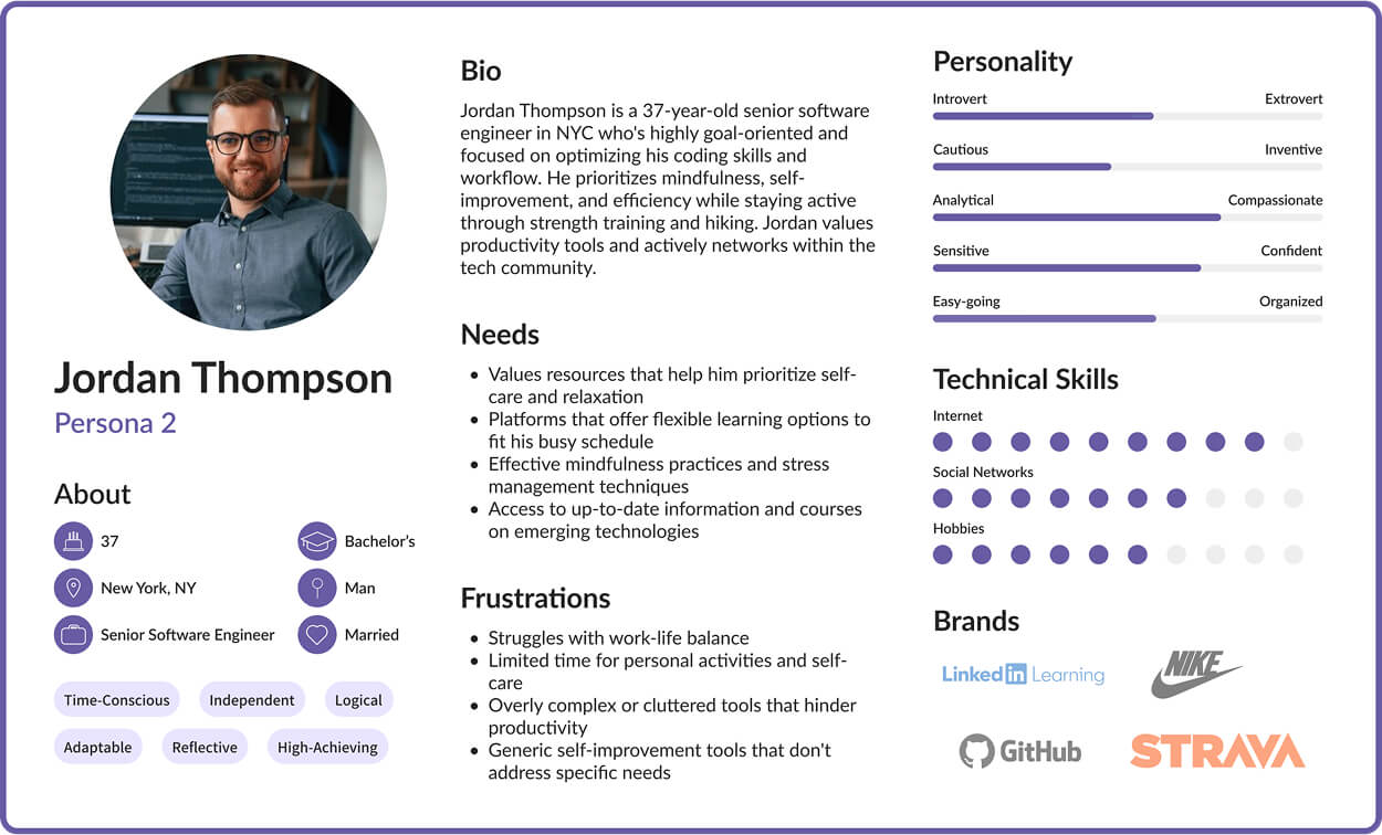
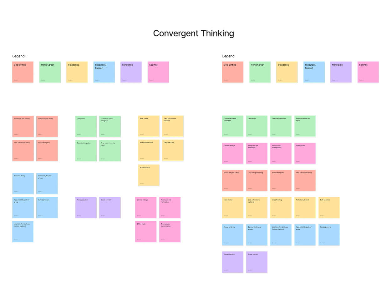
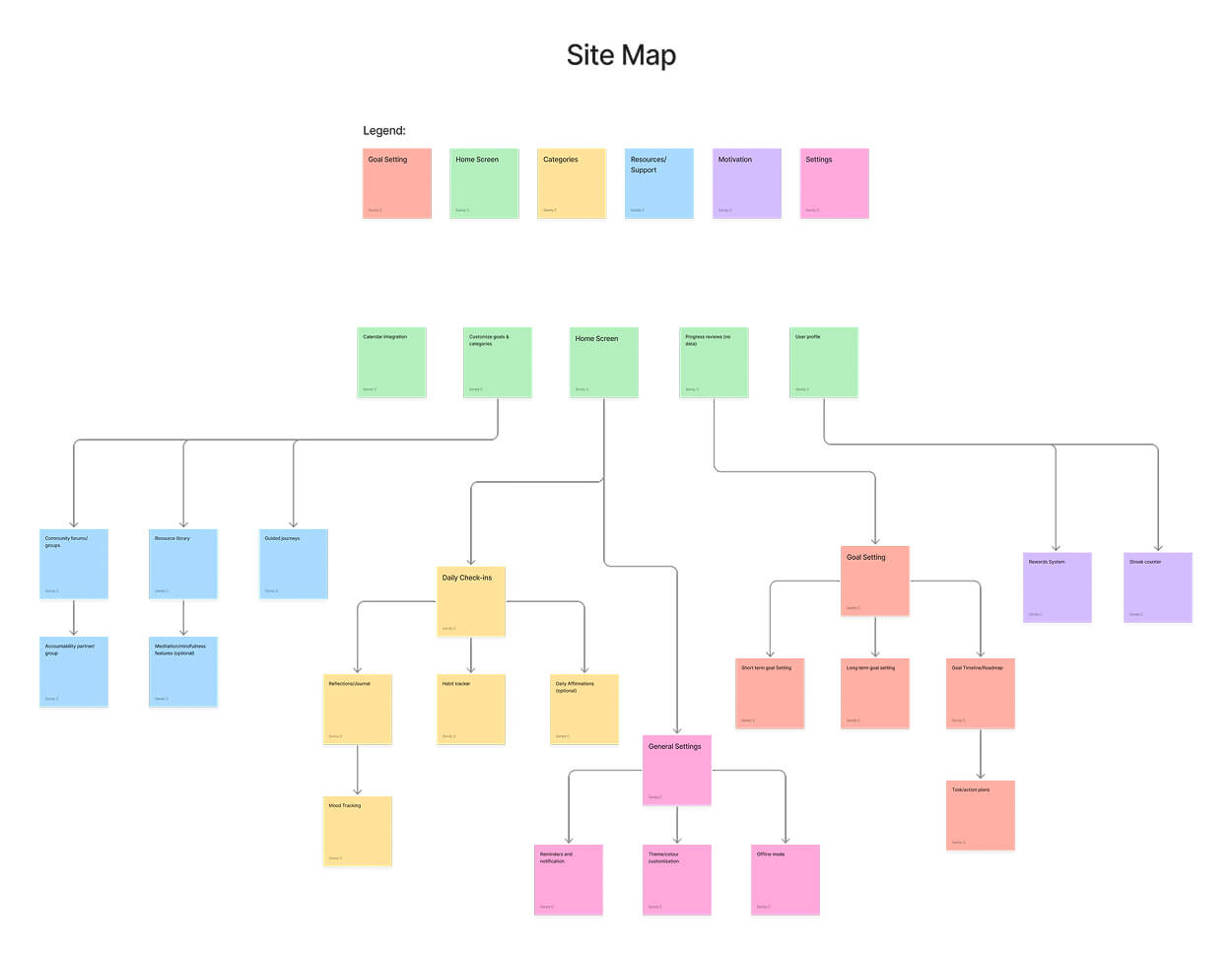
I initiated the design process by conducting a strategic analysis of Pathway's business and user goals: driving engagement and habit formation while enabling users to set meaningful goals aligned with their ideal self. This foundation led to target market research, two detailed user personas, and a mood board defining the app's aesthetic direction. For ideation, I mapped out the application's structure using FigJam to create a site map and task flow, then presented two low-fidelity sketch options for peer review, with the majority selecting Option 1 for its superior design and intuitive flow. Finally, I utilized Figma to build a comprehensive style guide and prototype, culminating in the polished, high-fidelity version.
Project Outcomes
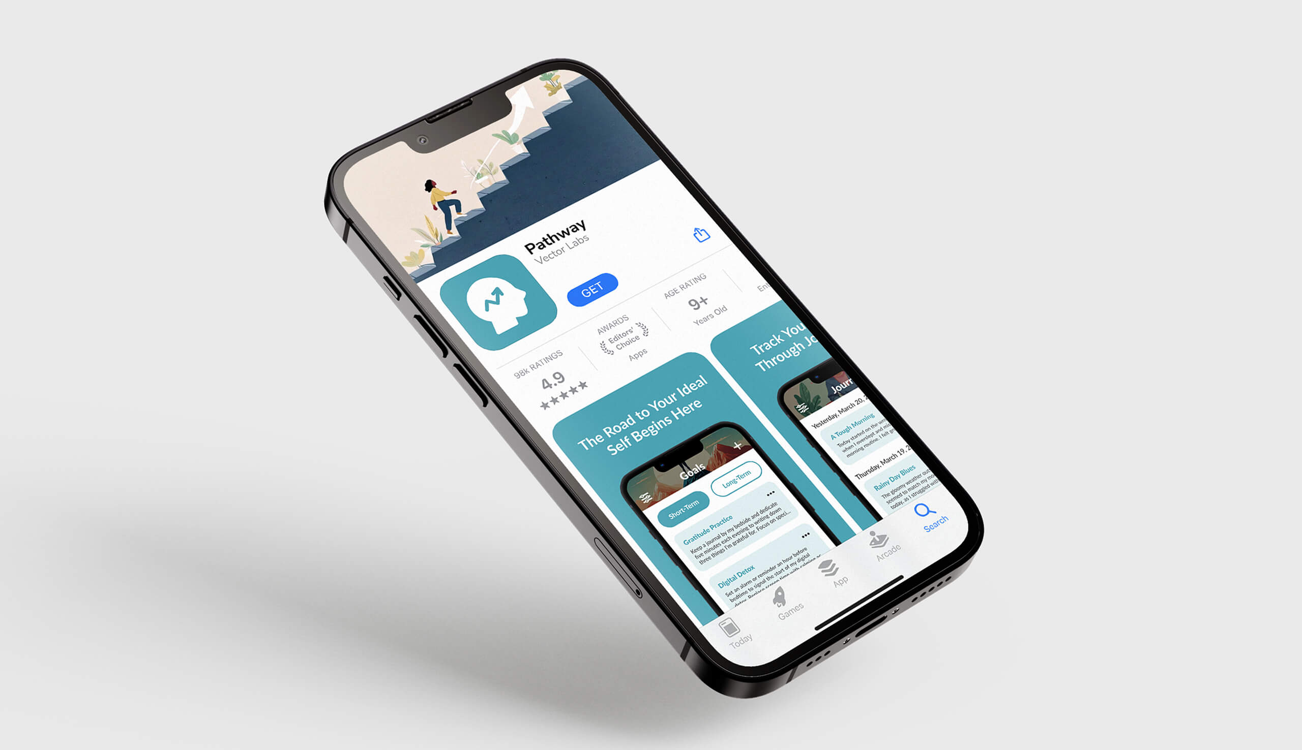
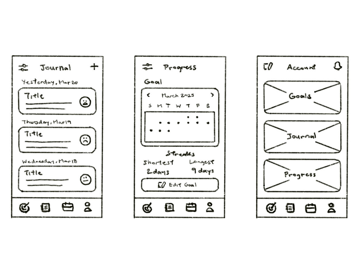
The final design delivers a minimal and visually calming interface, featuring a soft turquoise hue and custom AI-generated illustrations that establish the app's unique aesthetic. The design successfully addressed personalized progress: the Goals screen uses a toggle tab to separate short-term and long-term objectives, the Journal screen promotes self-reflection through daily mood and entry logging, and the Progress screen displays a monthly streak breakdown that motivates continuous engagement without confusing graphs.
This project demanded significant critical thinking to create a simple, intuitive layout that avoids the overly statistical approach of existing self-improvement apps. I strengthened my problem-solving skills by designing an interface tailored for users who prefer a clean experience over complex metrics, while my technical proficiency in Figma improved dramatically. Constructive input from a professional UX designer highlighted areas for further iteration, specifically regarding icon hierarchy and refining the switch tabs on the Goal screen for better usability.
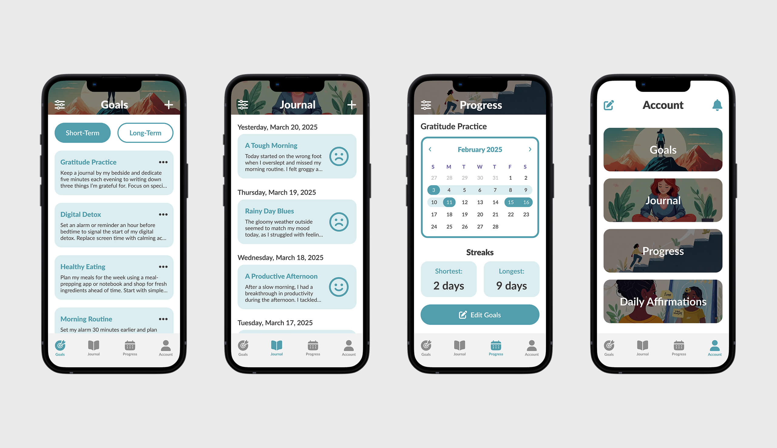
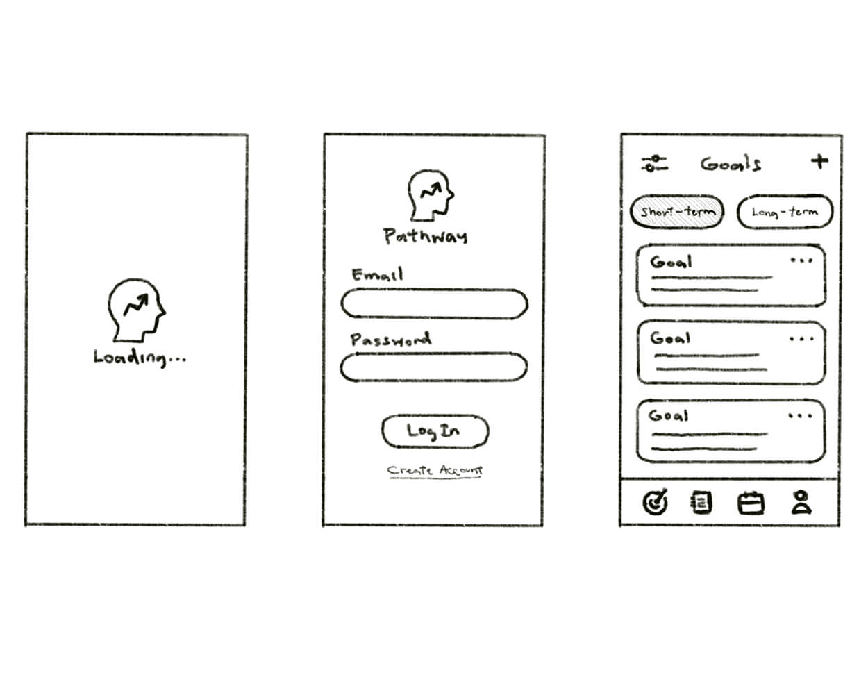
Pathway app main screens.
Future Considerations
Looking ahead, my first step would be to address the feedback received on icon hierarchy and switch tab design for improved usability, then develop a task flow prototype to illustrate key user journeys, such as how long-term goals are created and archived upon completion. While this case study presents only a snapshot of the core application screens, it reflects a strategic choice to focus on the essential features that drive user value. This project affirmed that the analytical thinking required in UX/UI is distinct from other design fields, and I am eager to continue improving my skills by applying these user-centric principles to future projects.
More Projects
Check out my other case studies to see my designs in action