Lipton Milk Tea Unwrapped: Packaging with Purpose
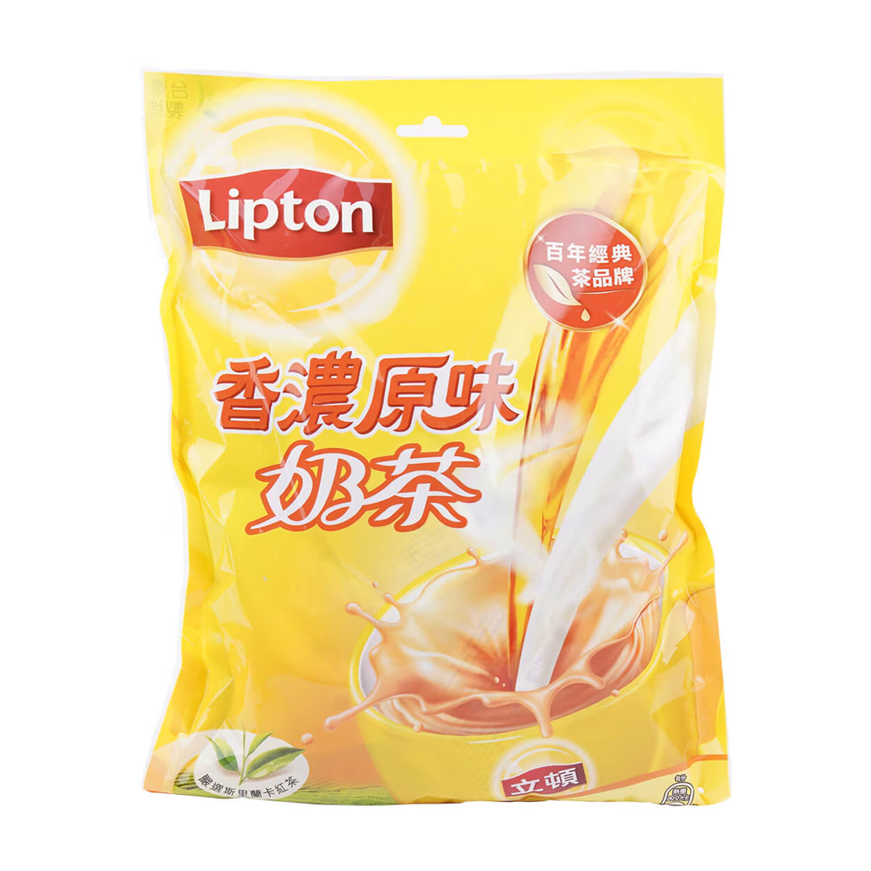
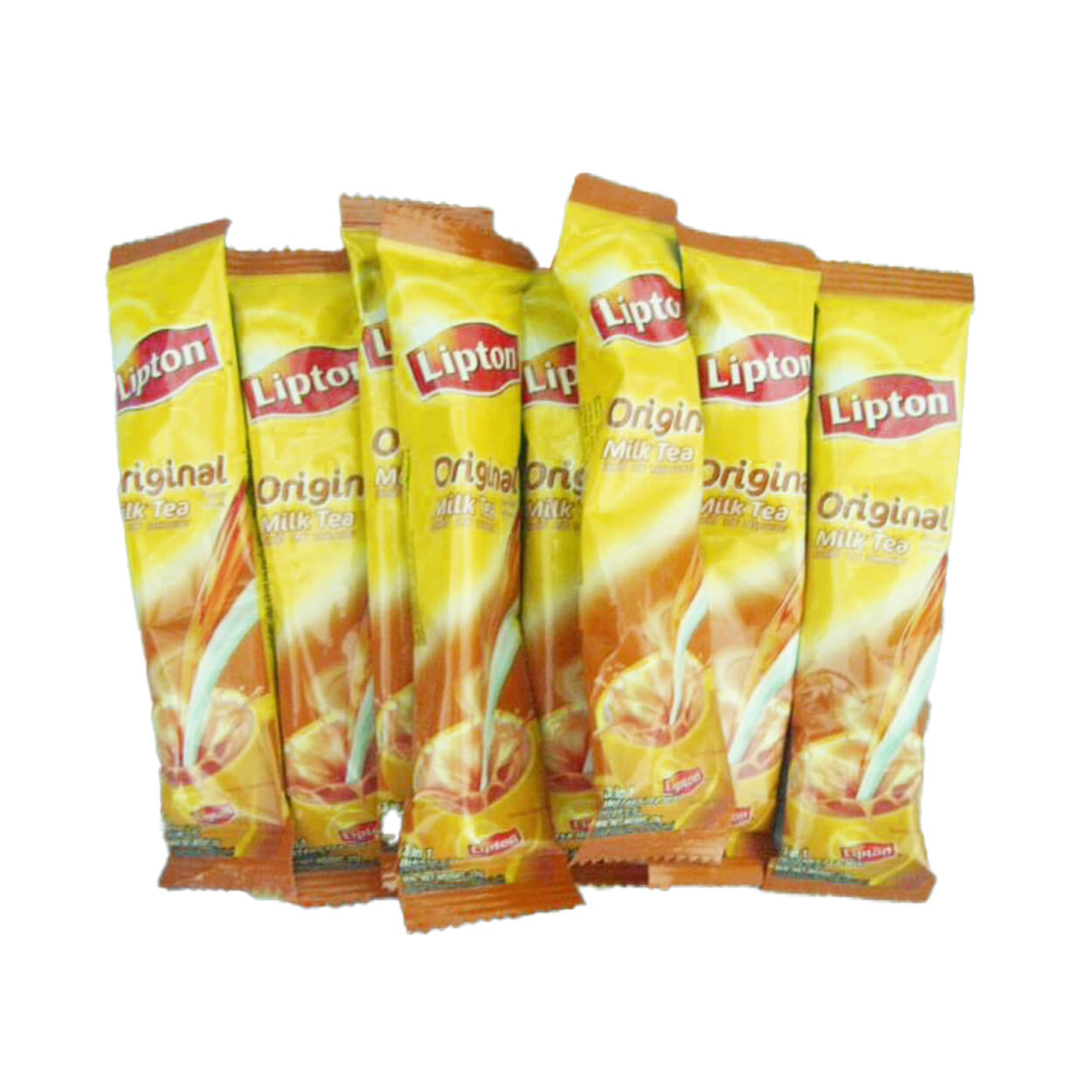
The objective of this school project was to strategically redesign the packaging for Lipton Milk Tea, moving away from the original plastic to a more sustainable solution. The core challenge was to develop an innovative, eco-friendly container that would appeal to existing customers but also attract a new, sustainability-minded audience. This project culminated in a finalized, production-ready packaging mockup.
Categories
Packaging Design
Product Design
Brand Strategy
Print & Layout Design
Tools
Illustrator
Photoshop
Overview
The primary design challenge was to develop an innovative, yet feasible, packaging solution for Lipton Milk Tea that met demanding sustainability requirements. A critical constraint was maintaining high brand recognition; the new design could not stray significantly from the established visual identity. This required balancing innovation with familiarity to stand out from competitors, whose packaging all shared a similar format, while utilizing sustainable materials and achieving a distinct presence on the shelf.
Skills
Strategy
Die-Cut Design
Hand Assembly
Mockup Prototypes
Illustration
Strategy & Execution
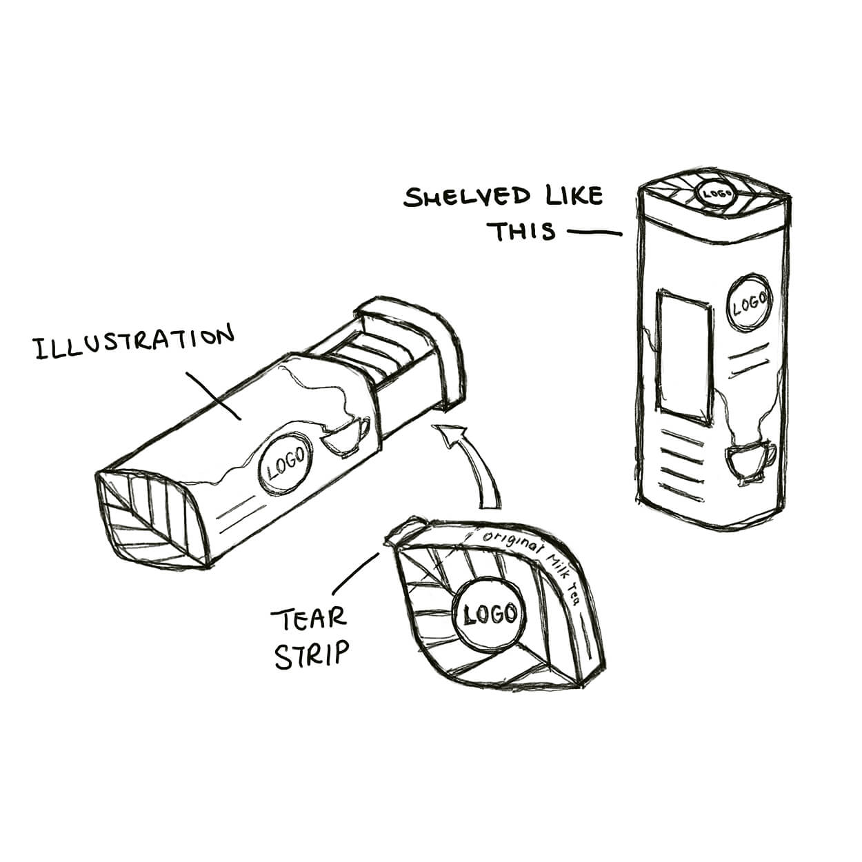
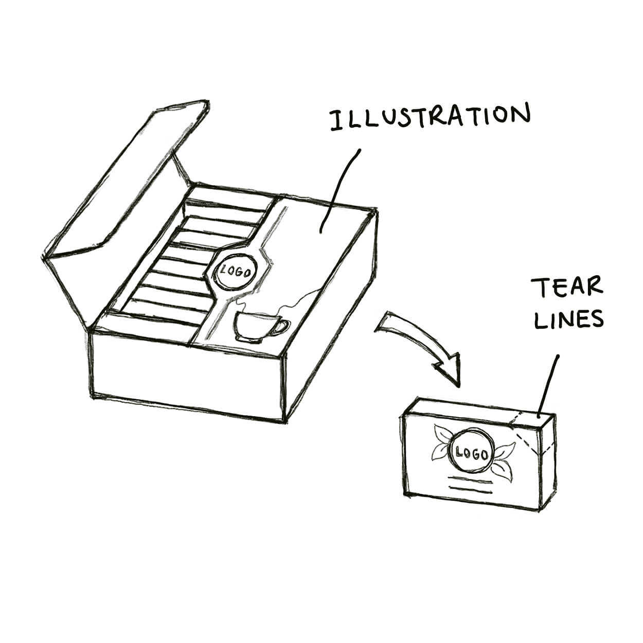
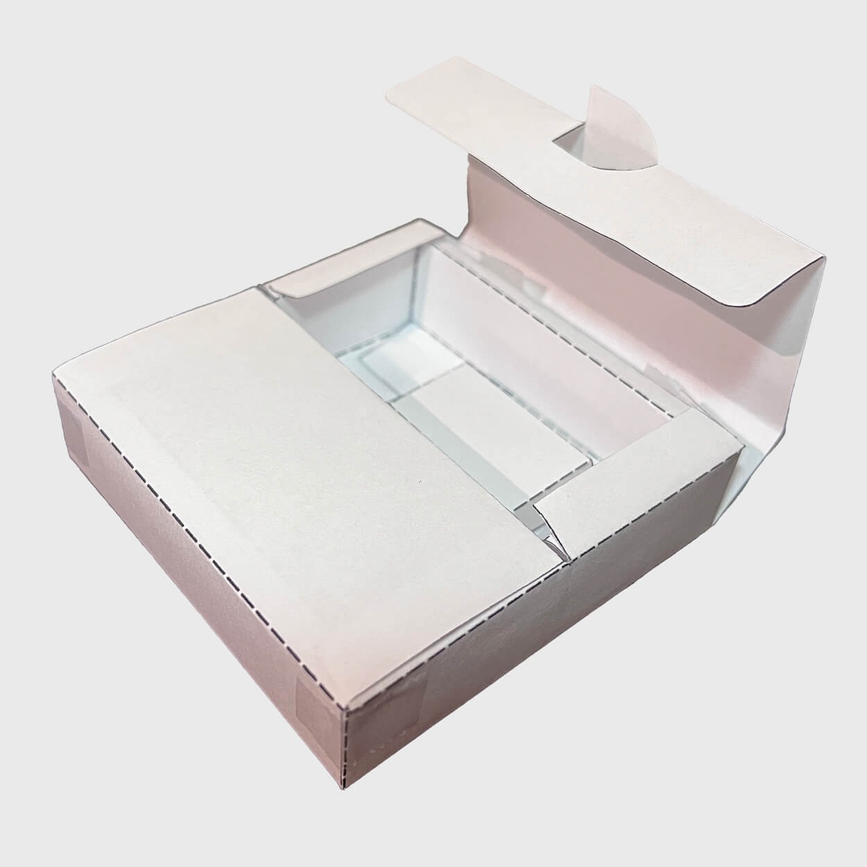
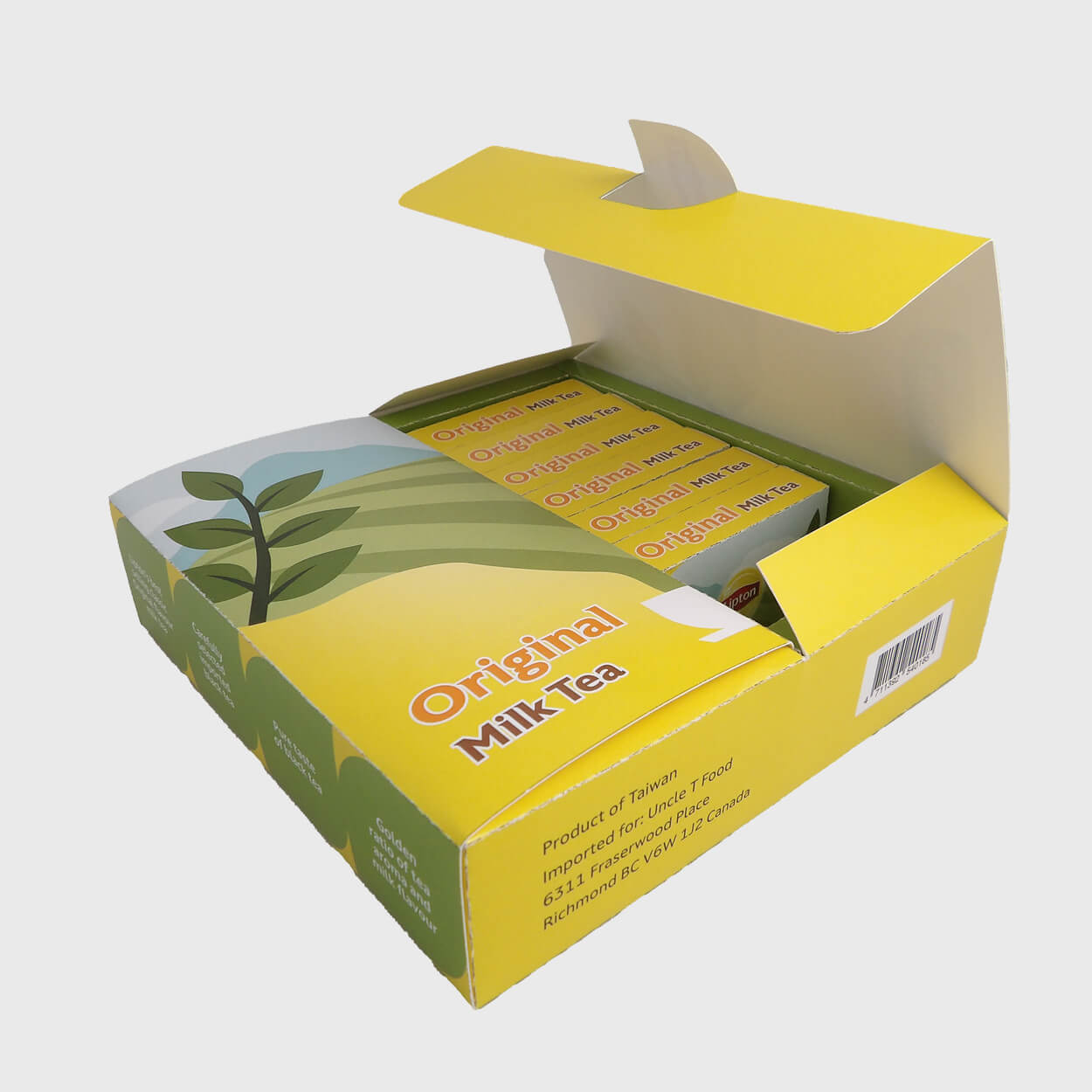
My process began with in-depth market research into the Lipton Milk Tea target audience and competitors. This analysis confirmed that the packaging needed to maintain the convenience of individual packets to cater to busy professionals and students seeking a quick preparation beverage. I developed a mood board to define colour, typography, and illustration styles before moving into ideation. I delivered two initial packaging concepts to my professor, ultimately selecting a double-door structure. This choice required several rounds of physical prototyping to validate the functionality. After three to four iterations, I successfully finalized the packaging illustrations and structural design.
Project Outcomes
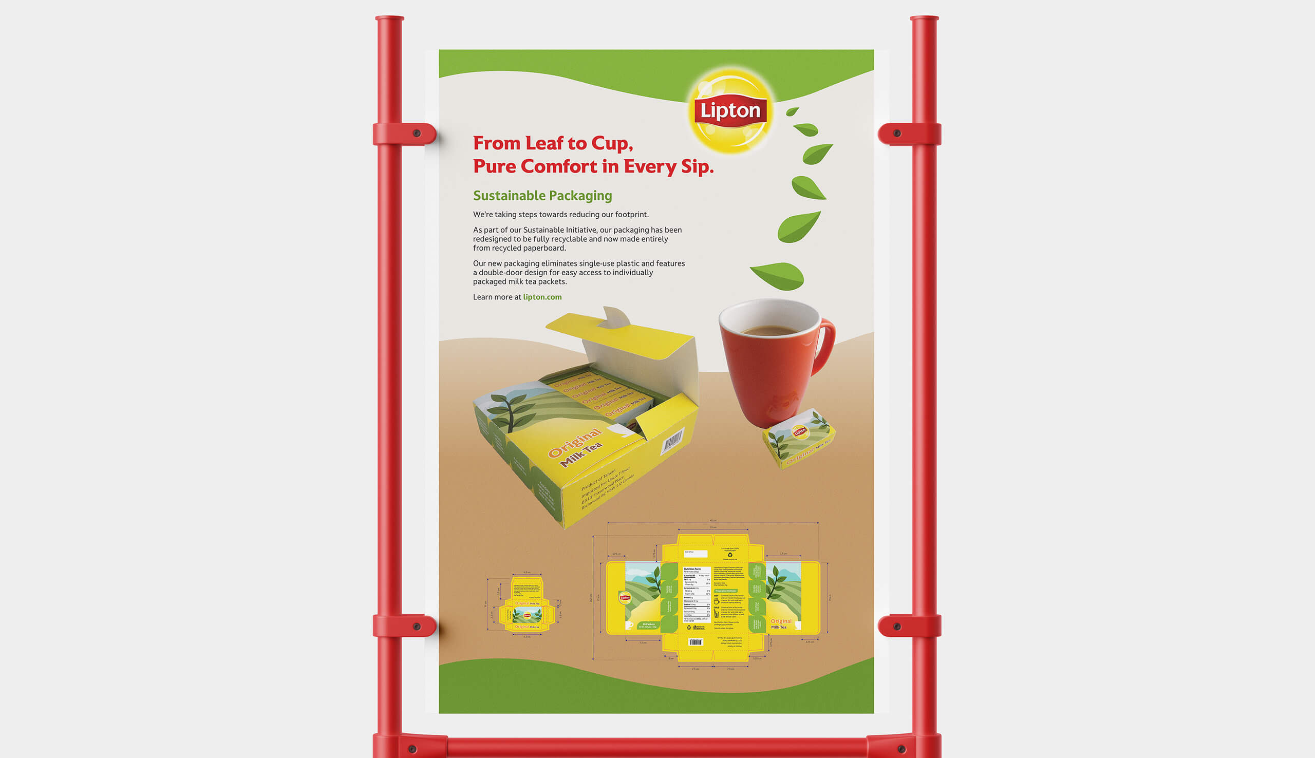
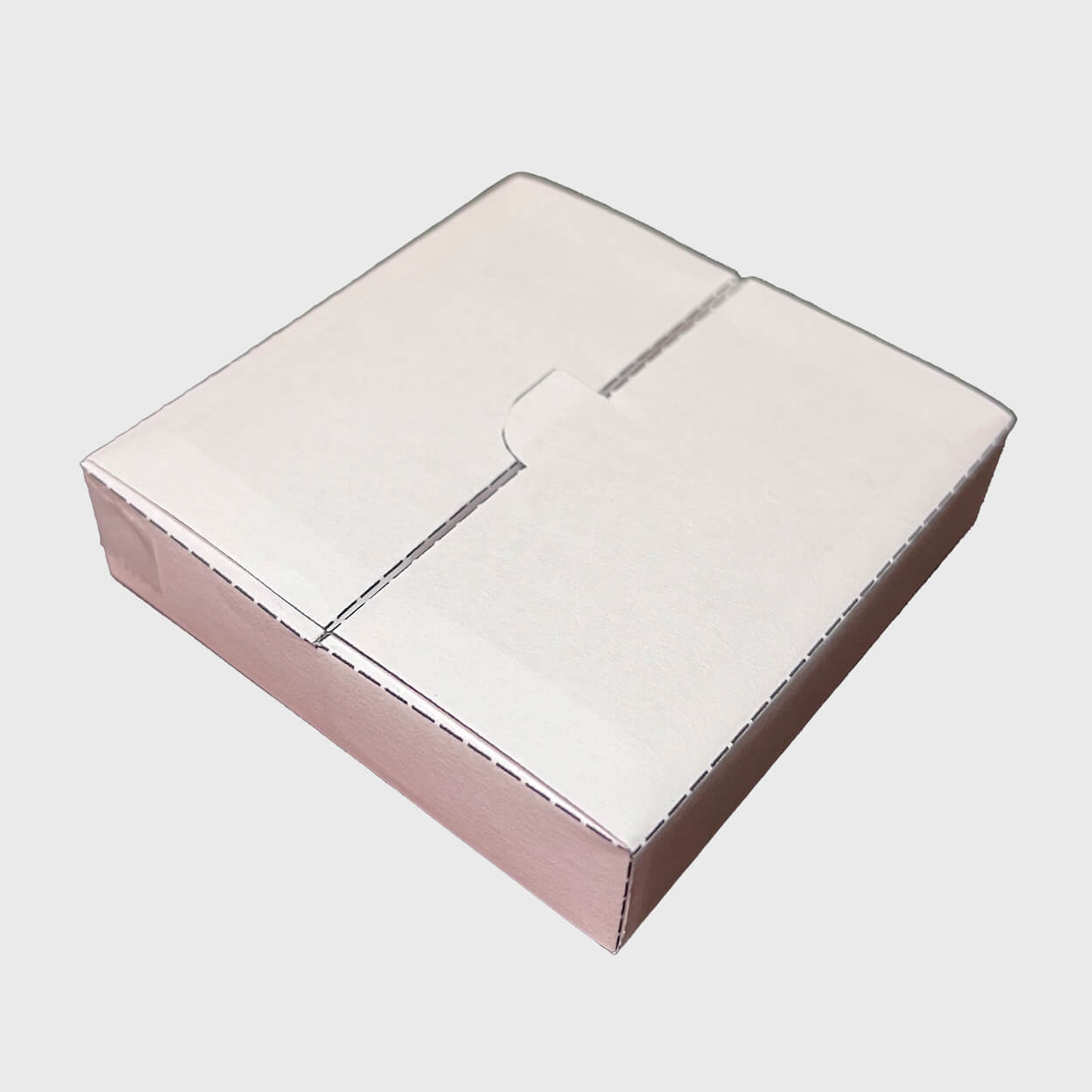
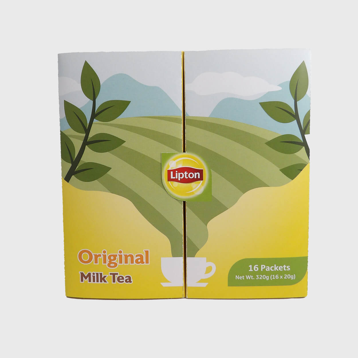
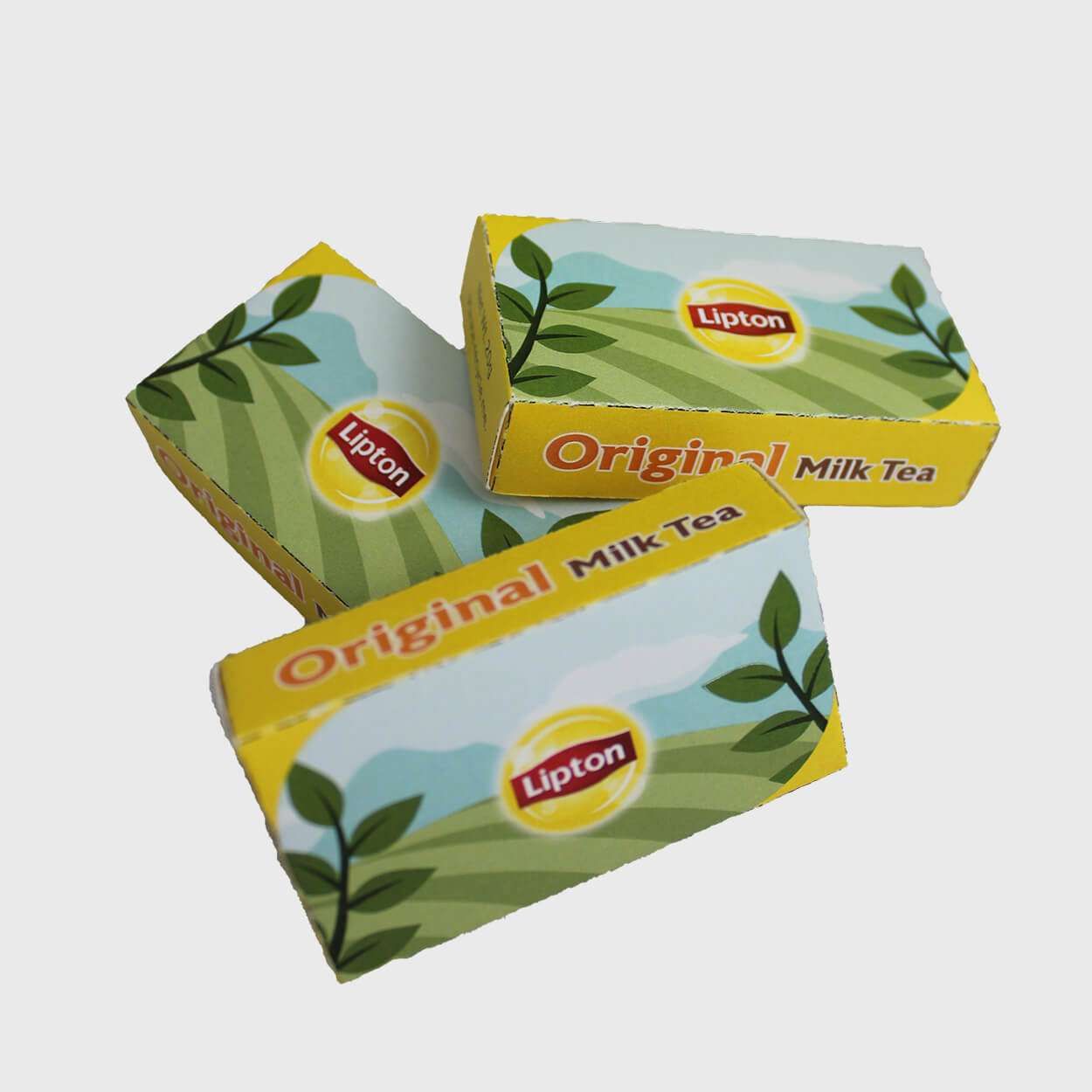
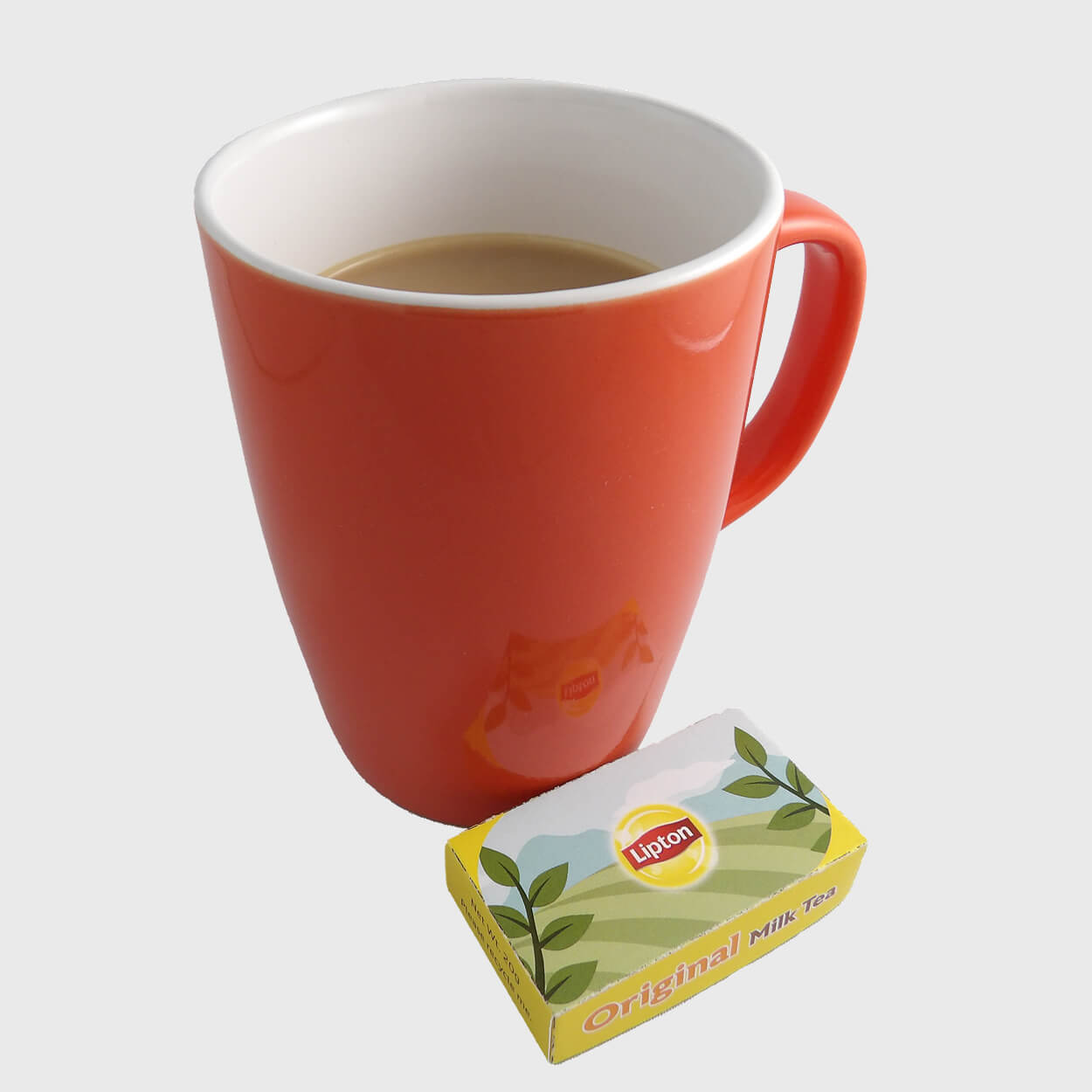
The redesigned packaging for Lipton Original Milk Tea strategically maintains the flavour's traditional colours while incorporating a more creative, premium feel. By shifting from single-use plastic to 100% recycled paperboard for the outer box and inner tray, the brand reinforces its commitment to being environmentally conscious. Consumers still enjoy individually packaged milk tea, now presented within a double-door structure that elevates the experience to a ritual while allowing the sturdy outer box to be reused or easily recycled.
This project required significant outside-the-box thinking to deliver a functional design that resonated with the current target audience. The structural demands challenged me to quickly learn die-cut packaging principles and refine my skills in precision assembly through considerable trial and error with multiple mini-mock-ups. My commitment to detail paid off, as both peers and my professor praised the quality, sturdiness, and overall design as a marked improvement over the original packaging.
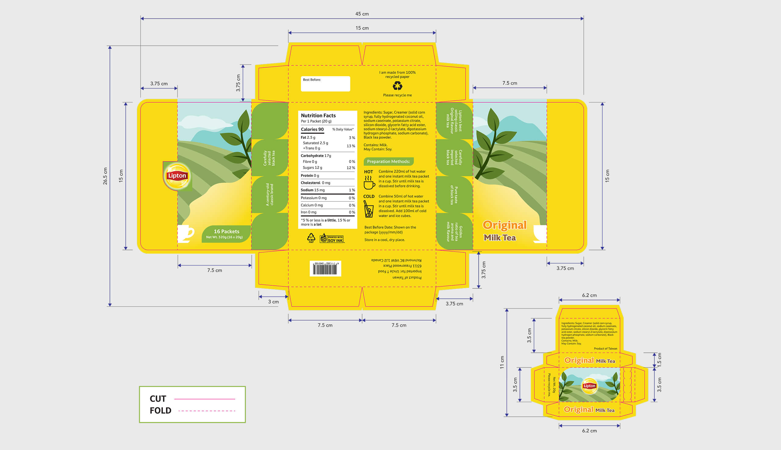

Lipton milk tea packaging die lines of the outer box, sachets, and inner tray.
Future Considerations
If I were to revisit this project, I would refine the back panel layout by adjusting the scale of the nutrition facts label. Its current size unintentionally dominates the secondary information and stands out too prominently. This project reinforced my understanding that structural packaging design demands meticulous preparation and iteration; while the process is lengthy, the rewarding outcome of a fully realized product is invaluable.
More Projects
Check out my other case studies to see my designs in action