Ottawa-Themed Beer Can Labels for Bicycle Craft Brewery
This school project tasked me with selecting an Ottawa craft brewery and designing a unique, eye-catching beer can label inspired by the city's landmarks. I chose Bicycle Craft Brewery for its clean, minimalist aesthetic, incorporating illustrations of the NCC River House and Remic Rapids Park to highlight Ottawa's riverside heritage.
Categories
Packaging Design
Illustration
Brand Identity Design
Print Design
Tools
Procreate
Illustrator
Overview
The design prompt required creating two beer can labels for Bicycle Craft Brewery that were distinctly Ottawa-themed, setting them apart from the brewery’s existing minimalist lineup while maintaining cohesion with its overall clean aesthetic. Key goals included selecting unique local motifs, avoiding commonplace symbols like the Tulip Festival or Winterlude, and ensuring the pair of labels functioned as a coordinated set that felt unified and visually compelling.
Skills
Research-Driven
Sketching
Digital Illustration
Vector Design
Label Design
Strategy & Execution
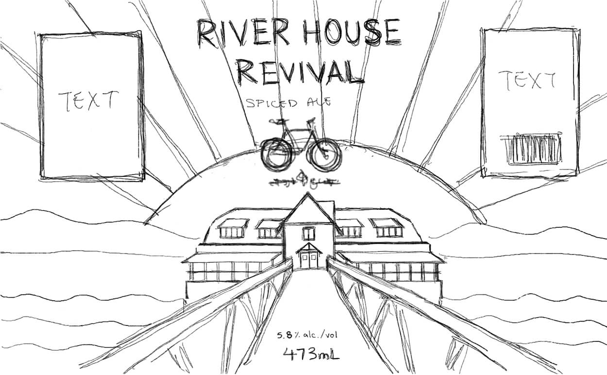
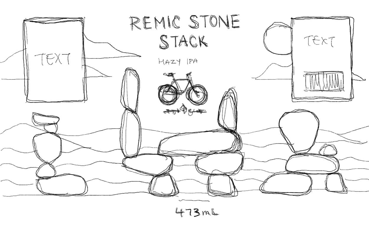
My process began with in-depth research into Bicycle Craft Brewery, exploring its history, community-focused goals, branding, and existing can designs to understand its emphasis on active lifestyles and local Ottawa pride. This inspired the idea of featuring landmarks where people might enjoy a beer outdoors, leading me to select the NCC River House and Remic Rapids Park for their scenic, riverside appeal. I assembled a moodboard to capture the desired aesthetic and colour palette, then sketched matching landscape illustrations in Procreate and refined them in Adobe Illustrator with precise vector tracing, applying colours and complementary backgrounds to enhance text readability and visual harmony.
Project Outcomes
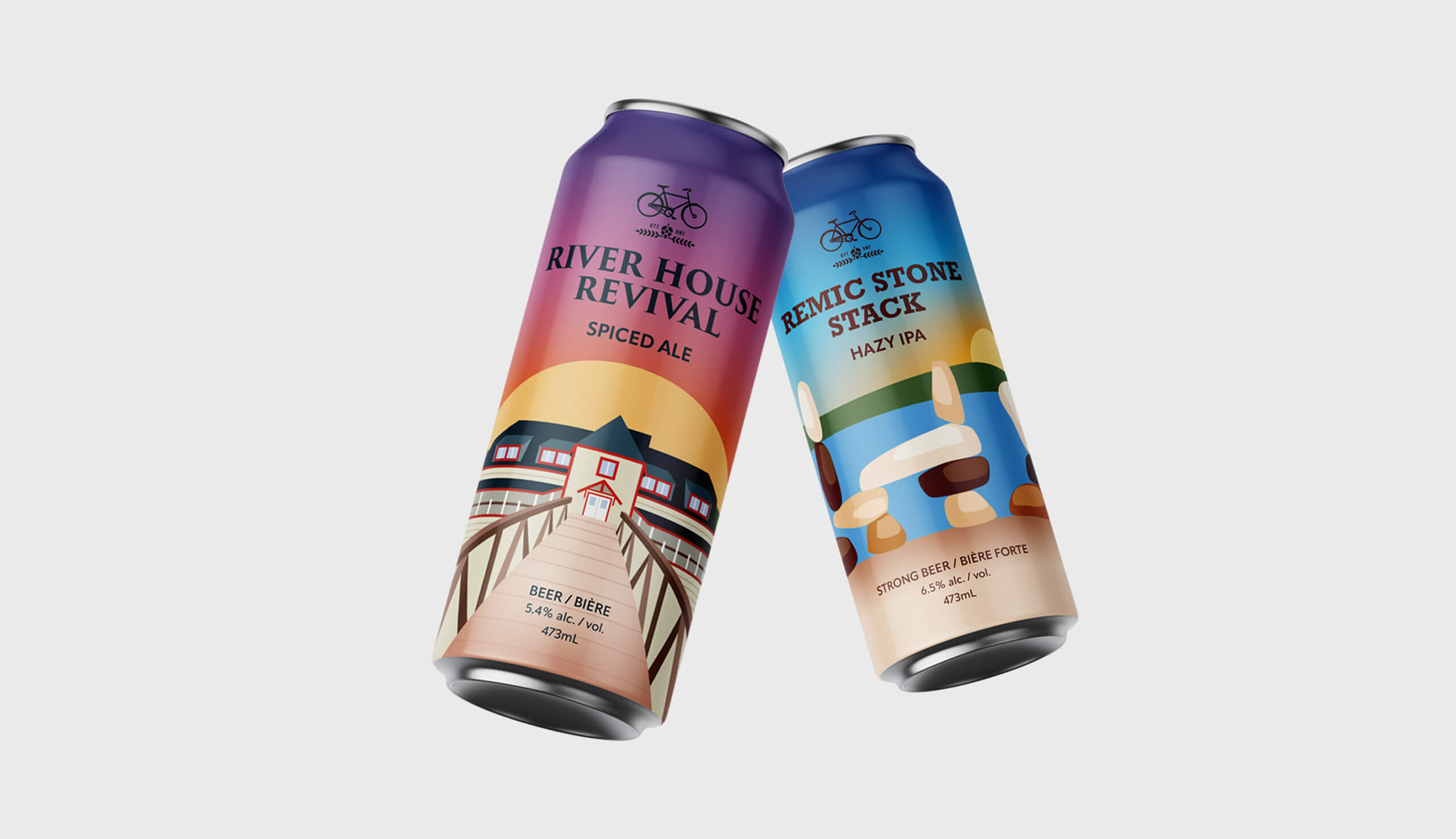
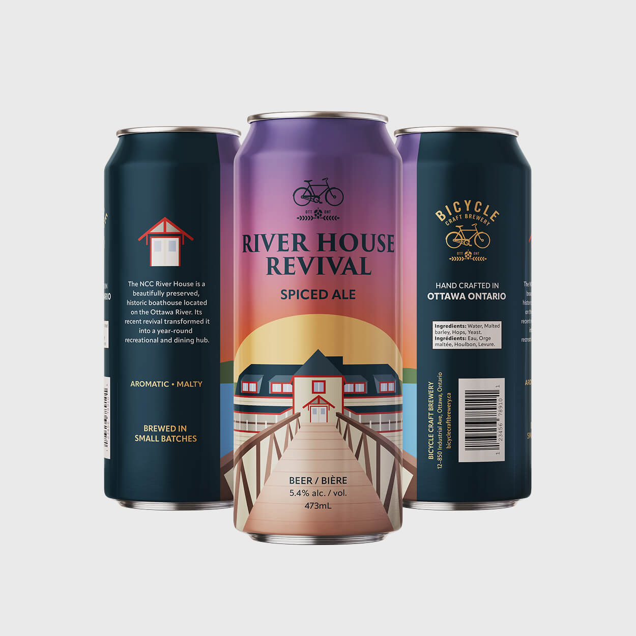
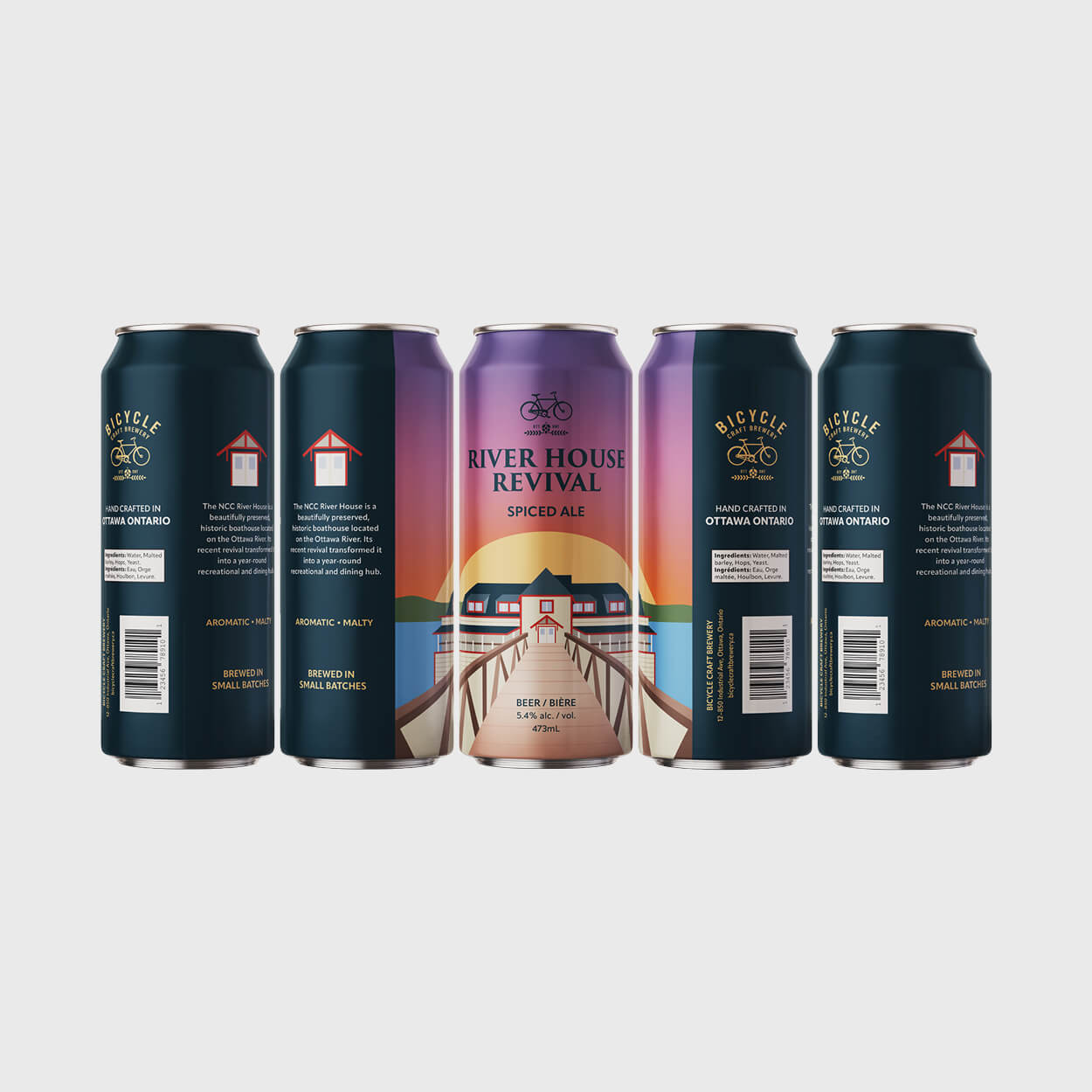
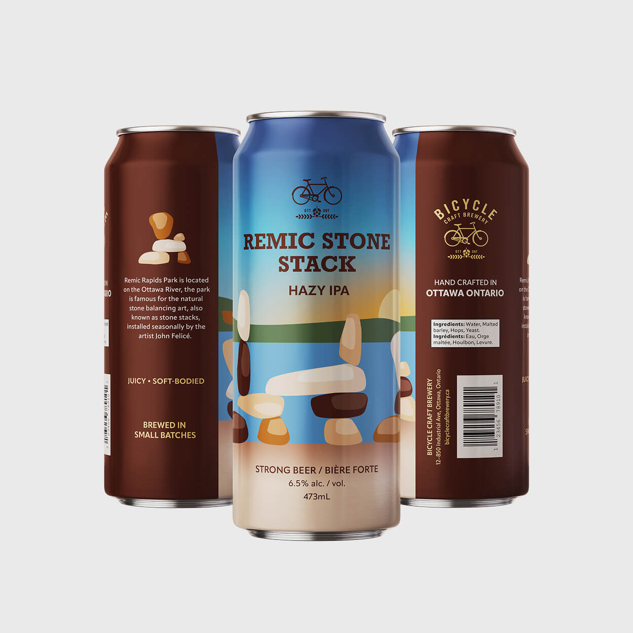
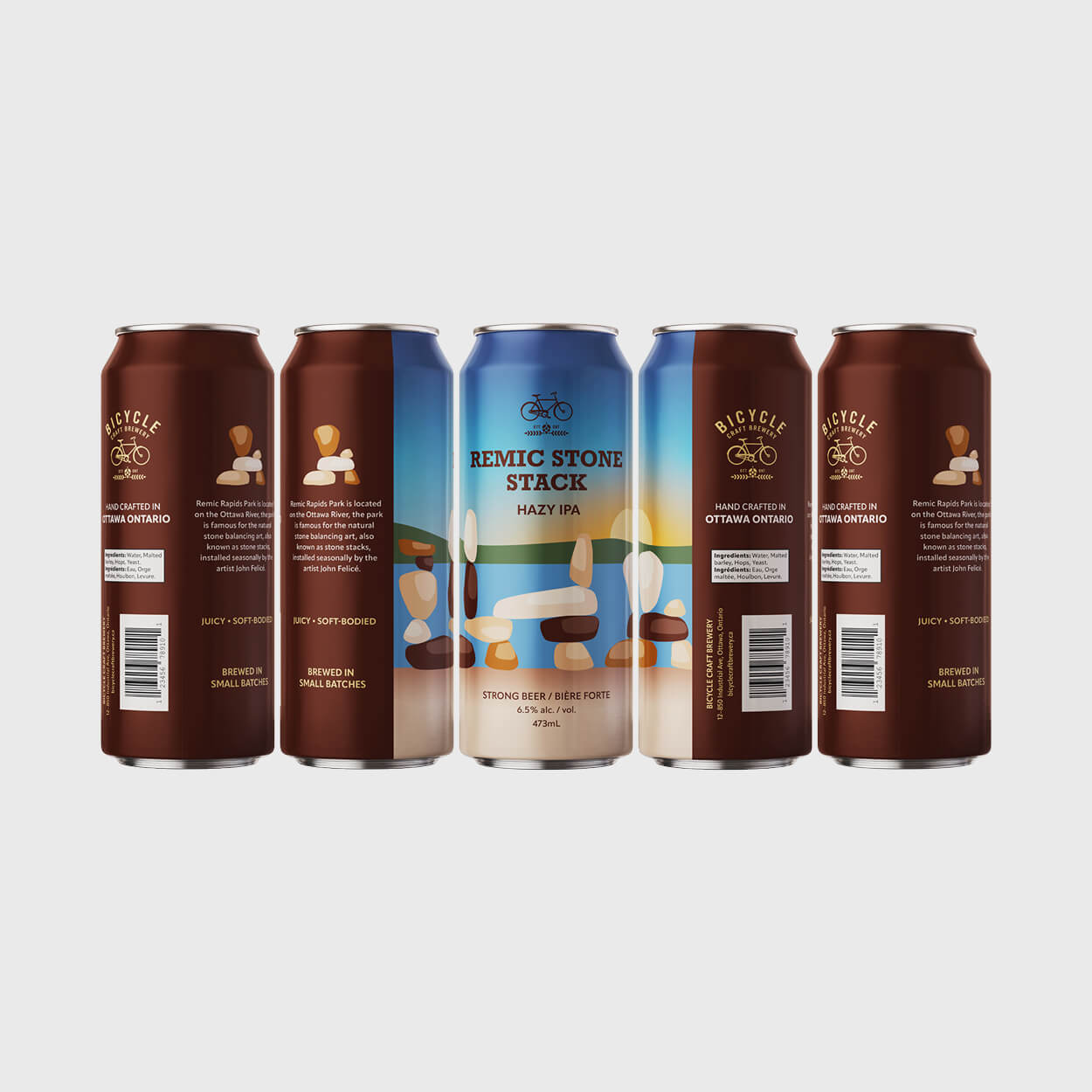
The final designs feature two cohesive beer can labels that form a unified set, blending seamlessly with Bicycle Craft Brewery's minimalist style. "River House Revival" highlights the historic NCC River House boathouse with striking red accents and a sunset backdrop, while "Remic Stone Stack" captures the seasonal balanced stone sculptures by artist John Felicé against a sunrise landscape, connecting the pair through complementary day-cycle imagery. Colour blocks from the label ends were integrated into the illustrations for better harmony, with a key element from the illustration placed above the description for quick visual recognition.
A key challenge was achieving vibrant colours, as initial illustrations appeared too muted for the bold style of craft beer packaging. I resolved this by intensifying background hues, integrating the text colour block's deep blue into elements like the boathouse roof, and adding subtle gradients to the ground and sky for cohesion, while incorporating sunset and sunrise imagery to boost visual appeal and connect the designs. The final result earned praise from peers, non-designers, and my professor for their professional, shelf-ready look, highlighting the value of iterative colour refinement in competitive packaging design.
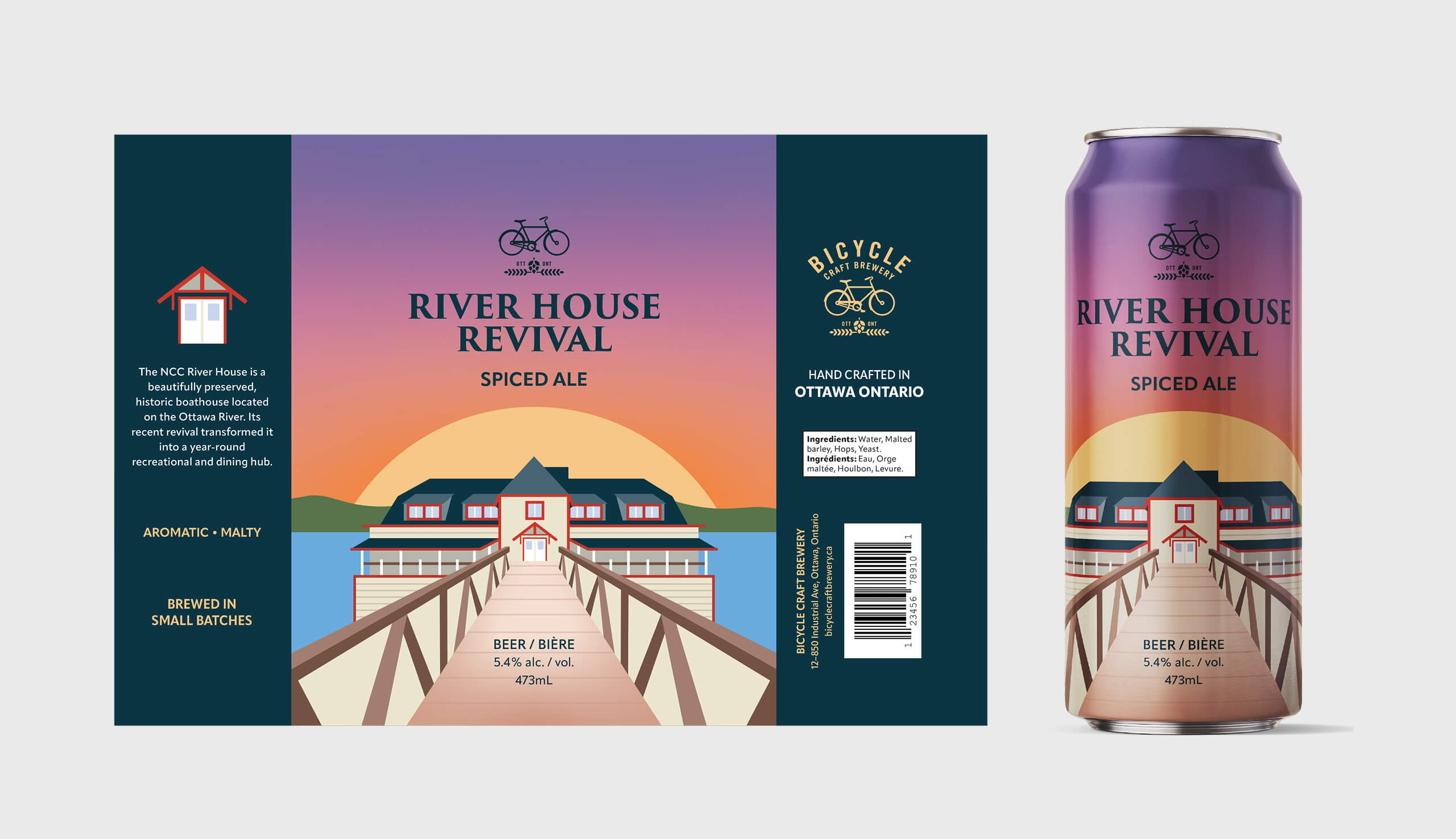
Can 01: River House Revival
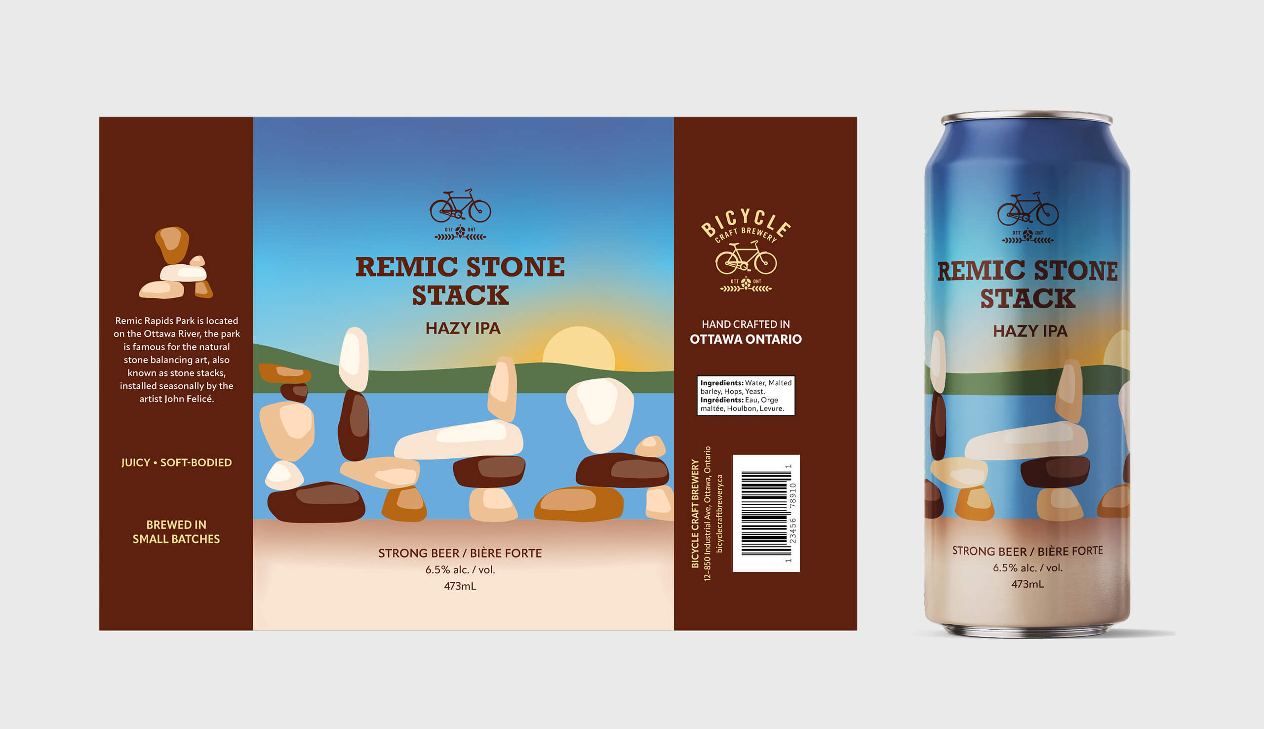
Can 02: Remic Stone Stack
Future Considerations
This project was completed under a tight deadline, which constrained my preferred extensive sketching phase and led to quicker decisions than usual. With more time, I could have refined the Remic Stone Stack illustration to match the greater detail in River House Revival, added subtle grain texture gradients, and improved title prominence, as the clean text sometimes felt understated against the vibrant artwork. Moving forward, I would experiment with slightly more distinctive yet minimalist typography that integrates seamlessly with the illustrations to create stronger visual hierarchy and impact.
More Projects
Check out my other case studies to see my designs in action