The Great Keeb Escape:
Unified Brand Experience
For "The Great Keeb Escape", an imagined keyboard enthusiast convention,
I designed a cohesive and adaptable brand identity. Leveraging my custom mechanical keyboard expertise, I created a unified visual system and vibrant, community-focused tone. This system was successfully applied across assets like emailers, posters, and banners, ensuring maximum visual impact.
Categories
Brand Strategy
Visual Identity Design
Print & Layout Design
Digital Asset Creation
Tools
Illustrator
InDesign
Overview
Designing a clean, impactful identity for a keyboard enthusiast event presented a strategic challenge. The goal was to capture the welcoming community spirit of an escape for hobbyists while ensuring versatility across all promotional applications.
I chose a simple concept with bold, balanced colours to ensure high visibility without overwhelming the detailed visual identity.
Skills
Strategy
Ideation
Print Assets
Digital Assets
Signage and Displays
Cross-Platform Adaptation
Strategy & Execution
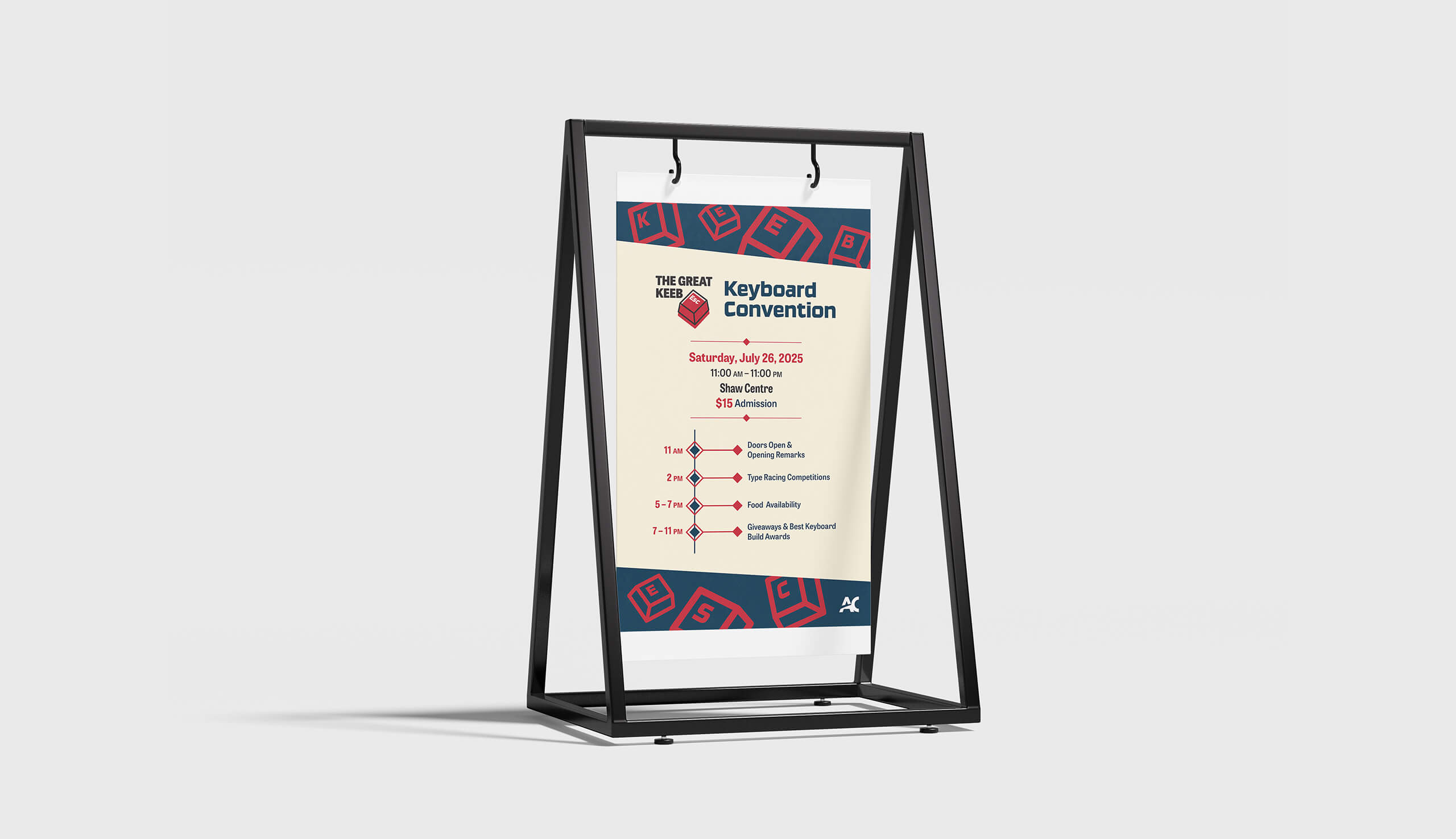
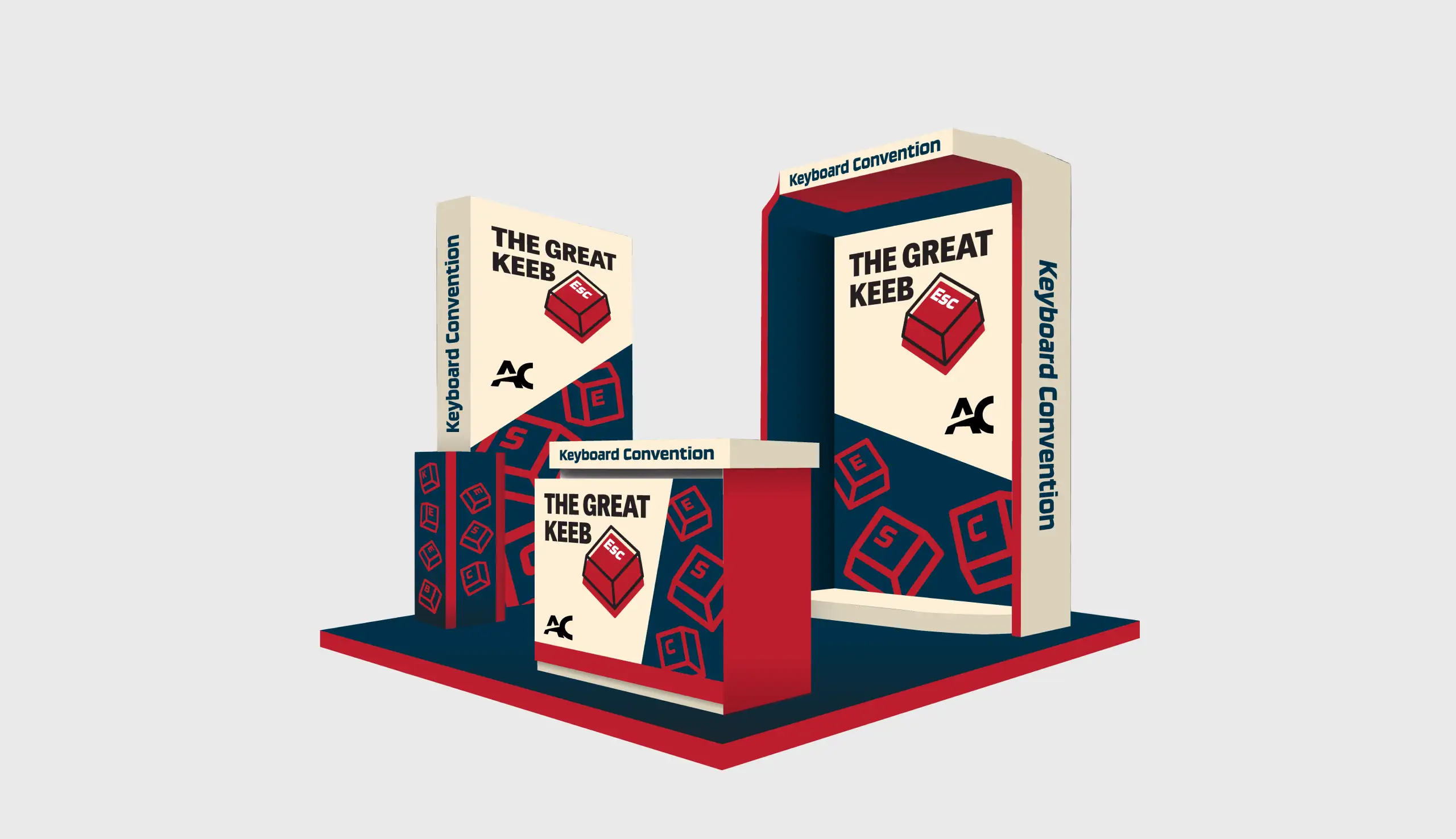
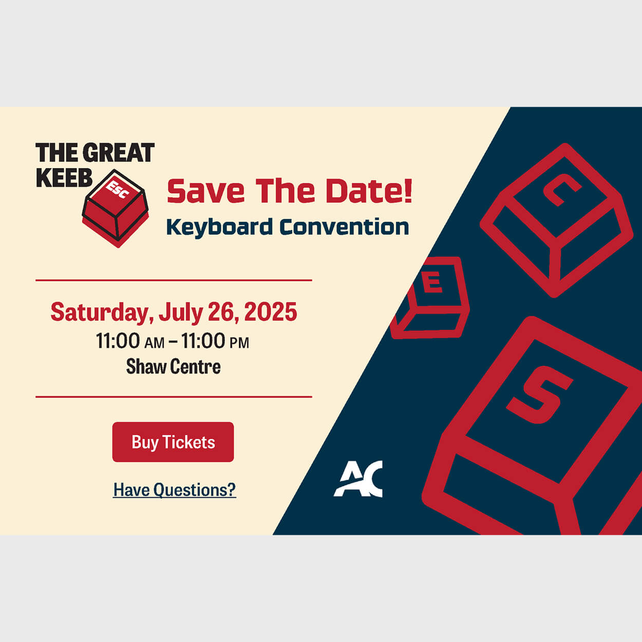
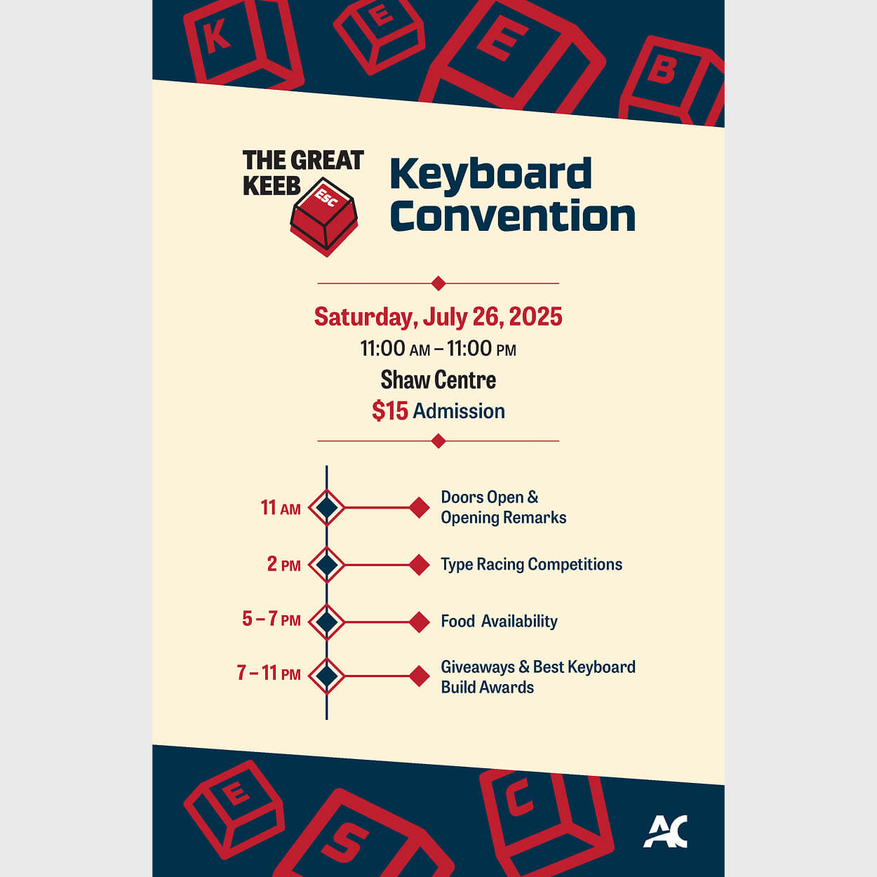
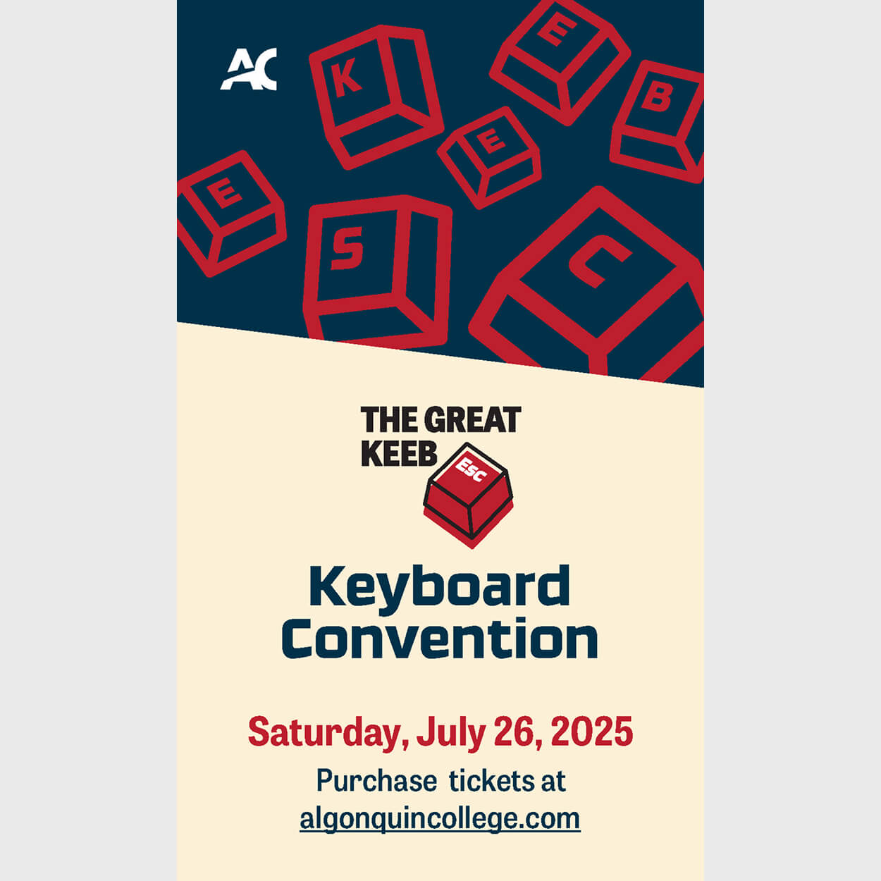
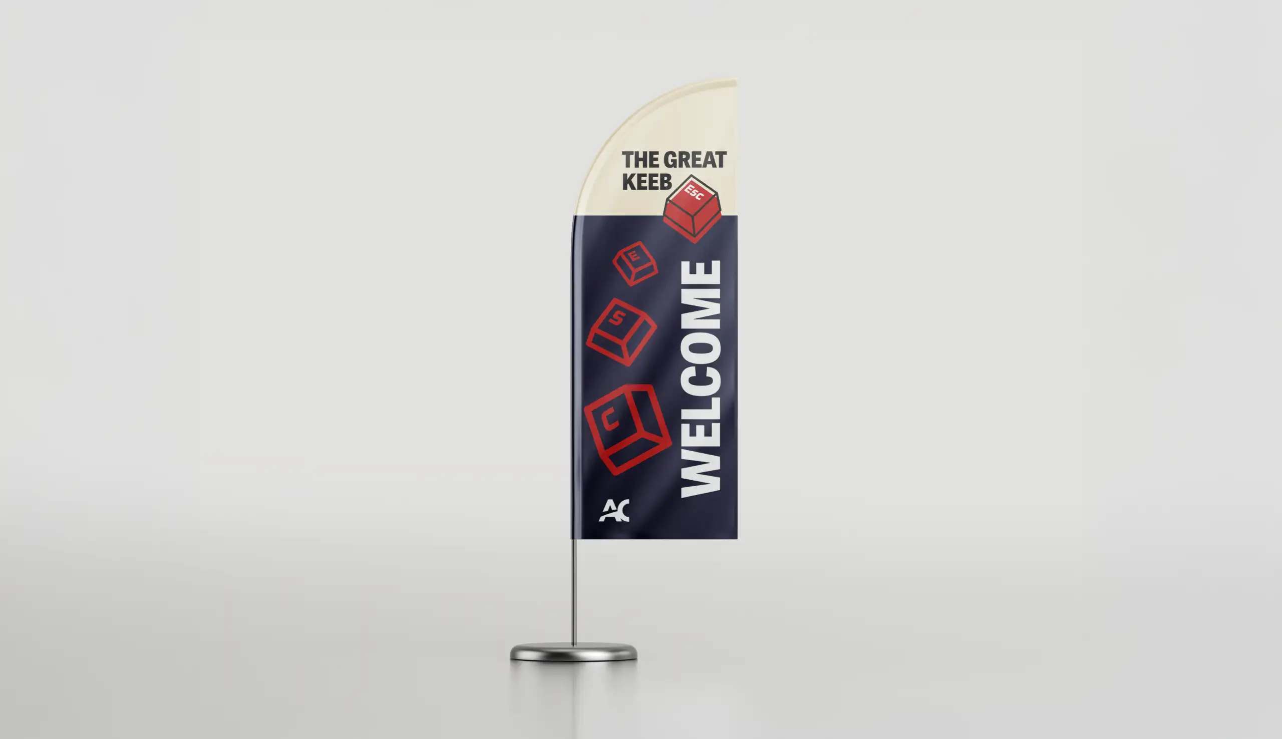
I initiated the project by developing the name and logo, establishing The Great Keeb Escape to emphasize a retreat for passionate keyboard hobbyists. The logo integrates the Escape key with the term "keeb", a widely recognized community shorthand, to enhance the event's niche appeal. This "escape" concept was consistently reinforced across all promotional materials, notably through keycap graphics spelling out E, S, and C. A bold red and navy blue colour palette was strategically chosen to convey a high-energy gaming aesthetic, aligning the brand identity with the strong preference of many keyboard enthusiasts, resulting in a cohesive and targeted visual system.

Project Outcomes
The strategic application of the red and navy colour palette, paired with the consistent integration of the "ESC" motif across all touchpoints, including emailers, feather banners, posters, web banners, and kiosks, successfully created a cohesive and inviting brand identity for The Great Keeb Escape. This unified design approach not only reinforced the event's core theme of an enthusiast-driven retreat but also delivered a visually striking and memorable experience that resonated strongly with the specialized keyboard enthusiast community.
Despite a tight production deadline, I leveraged my expertise in custom mechanical keyboards to successfully design a highly resonant brand identity that immediately connected with its niche audience. I developed versatile applications optimized for both print and digital platforms, including a full suite of promotional assets. My peers and professor specifically praised the strategic use of the "ESC" motif in the logo and across all materials for its clever, cohesive execution and overall impact.

Future Considerations
Reflecting on The Great Keeb Escape project, I see an opportunity to further enhance design consistency by fully incorporating the diamond shapes from the poster across all promotional applications, or, alternatively, redesigning the poster to align with the existing broader visual system. Crucially, I learned that a bold, yet restrained design approach is more effective for creating brand impact than an overly complex or detailed motif.
More Projects
Check out my other case studies to see my designs in action