Mesh for Men: Cohesive Brand Identity
This school project completely reimagined the brand identity for Meg Shaw’s men’s hair systems business. I delivered a comprehensive package including a new logo, motion-animated logo, stationery, brand guidelines, and a website redesign. The aim was to establish a cohesive, sophisticated identity that conveys premium reliability and trust to customers.
Categories
Brand Strategy
Visual Identity Design
Print & Layout Design
Web Design
Tools
Illustrator
Photoshop
InDesign
After Effects
Figma
Webflow

Overview
The original logo’s orange-to-black gradient lacked versatility and clarity in smaller applications, while the website's harsh orange and black palette failed to convey the approachable, sophisticated character essential for a trustworthy men’s hair systems brand. The prompt was to redesign the outdated logo and develop a complete brand identity that projects reliability, loyalty, and subtle luxury. Key goals included ensuring visual clarity, aligning with a trustworthy brand perception, and seamlessly integrating multiple design elements.
Skills
Research-Driven
Sketching
Logo Creation
Logo Animation
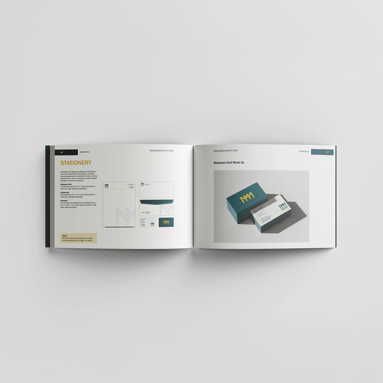
Stationery Design
Branding Guide
Website Build
Strategy & Execution
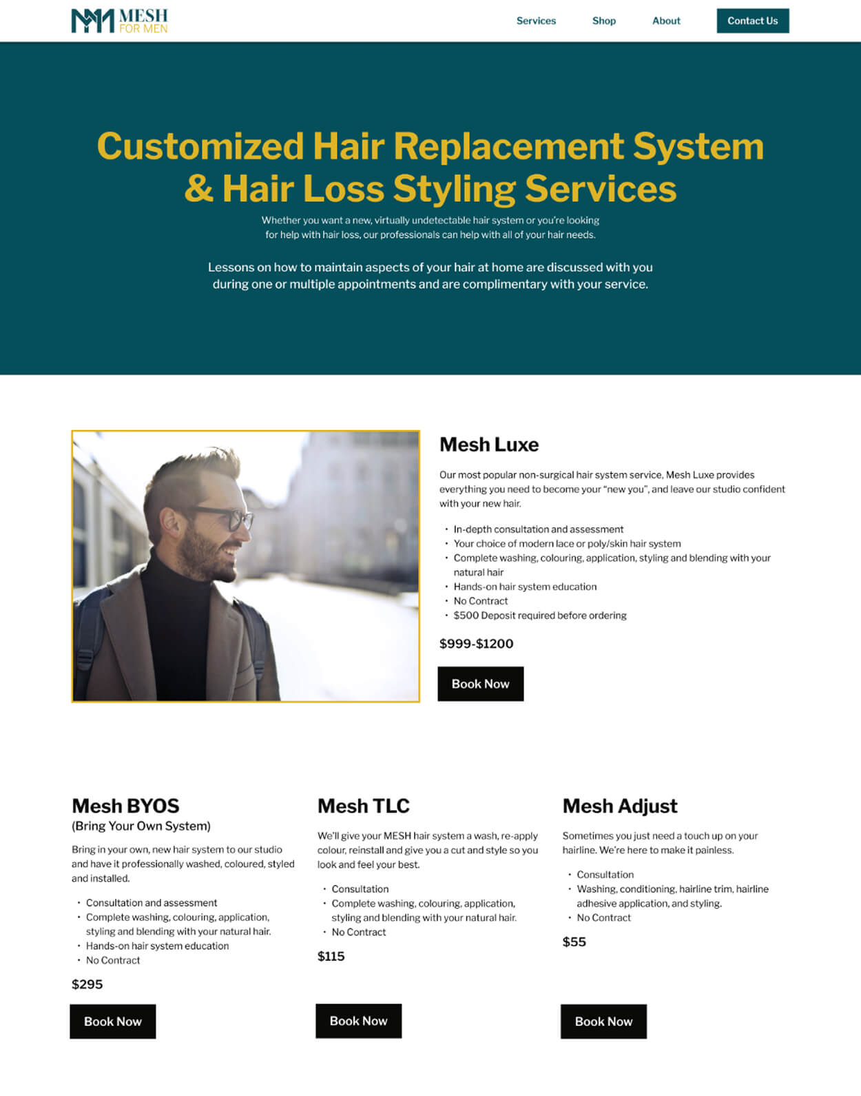
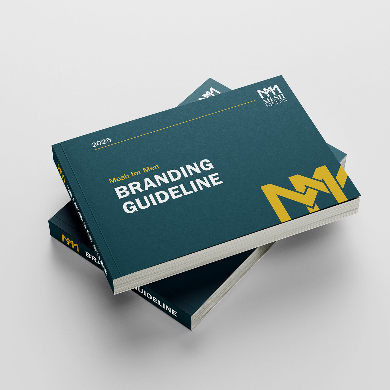
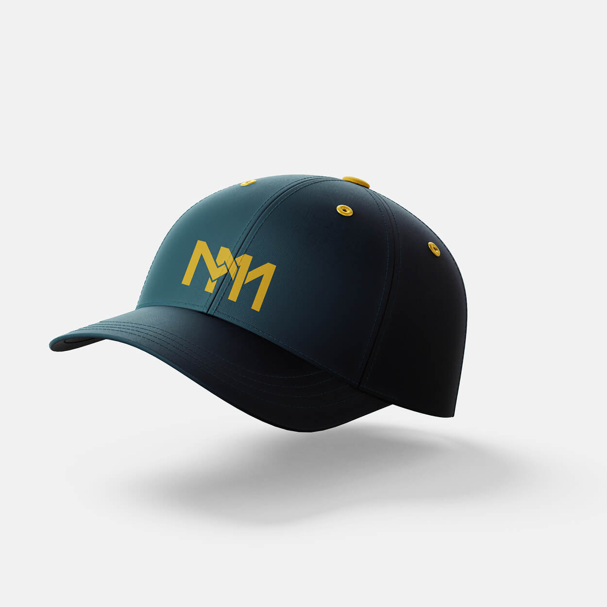
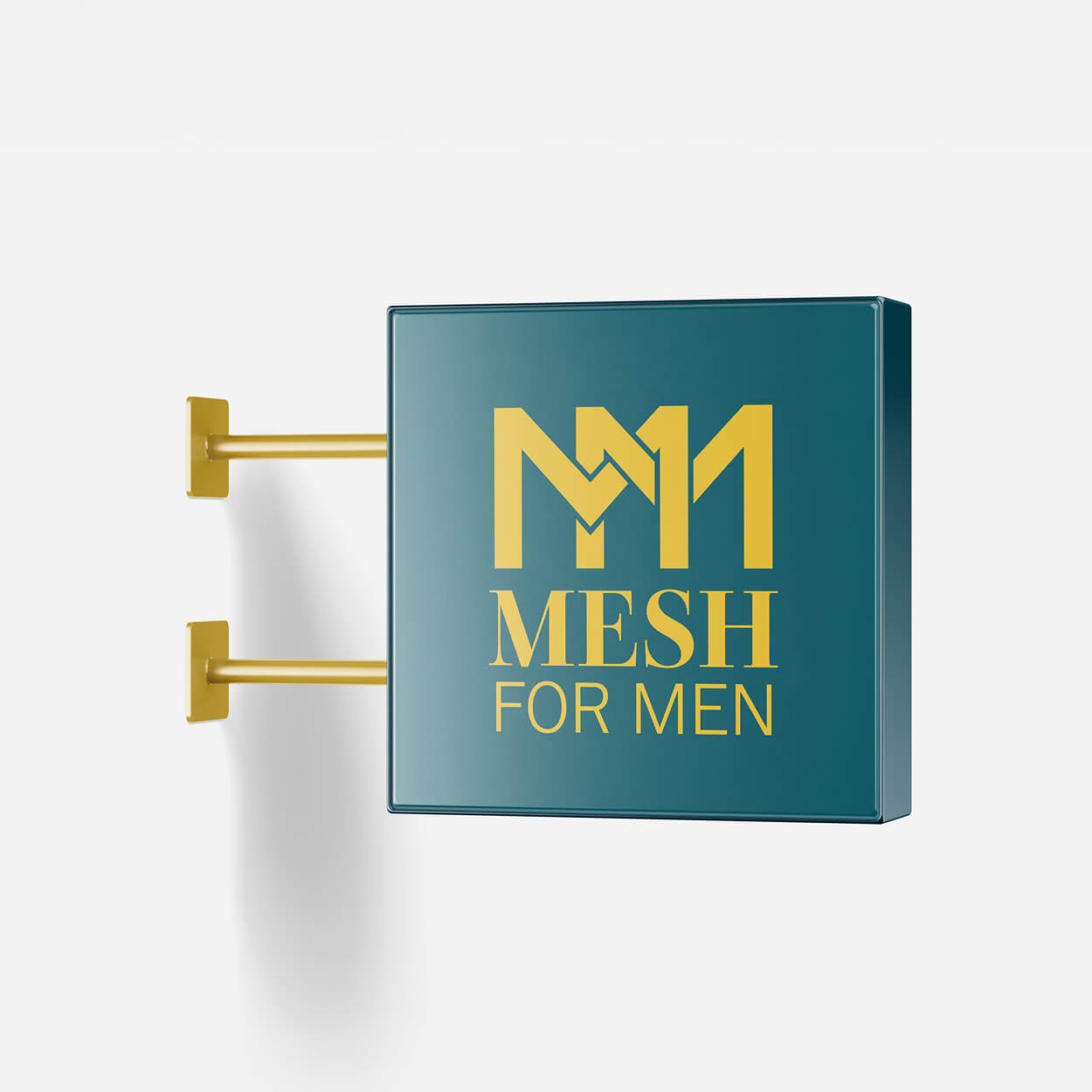
For Mesh for Men, a non-surgical hair replacement brand, the process began with in-depth research into the target audience and key competitors like HairClub and Lordhair. This analysis was crucial in defining a professional yet approachable brand identity centered on building customer confidence. I then sketched diverse logo concepts in black and white, ultimately refining a monogram and wordmark using serif fonts to establish a luxurious feel. I paired this with a distinct palette of teal and golden yellow for stationery and the website. The final design features two interlocking "M" letters above the wordmark in a modern serif font, applied consistently across business cards, letterhead, envelopes, and the website, with detailed branding guidelines ensuring cohesive implementation across all touchpoints.


Project Outcomes
The final logo is a minimalist monogram with two interlocking "M" letters that visually mesh together, rendered in teal and golden yellow for a subtle, luxurious feel. The complete stationery package and detailed branding guideline ensure a unified, cohesive application.
I built the responsive Webflow website with intuitive navigation and a friendly yet upscale aesthetic. Together, these unified elements successfully resolved the brand's visibility issues, creating an impactful identity that aligns with a loyal and trustworthy perception.
This project strengthened my ability to design fully unified brand systems, seamlessly integrating motion graphics, UX principles, and traditional graphic design elements. The final results were well-received: my professor specifically complimented the subtle symbolism within the logo, and my peers praised the logo's clarity and the website’s polished, inviting aesthetic. Crucially, I improved my technical proficiency in After Effects for creating high-quality animations and Webflow for robust, responsive web design, greatly boosting my overall versatility.
Mesh for Men logo animation.


Future Considerations
If I revisited this project, I'd experiment with the thickness of the monogram to further enhance the luxurious feel while maintaining its minimalist integrity. This project reinforced my belief that a meticulous, empathetic approach is crucial for balancing creative exploration with practical goals, ensuring every design is purposeful. Ultimately, this work deepened my passion for crafting cohesive, meaningful visuals that tell authentic stories through subtle details.
More Projects
Check out my other case studies to see my designs in action